
|
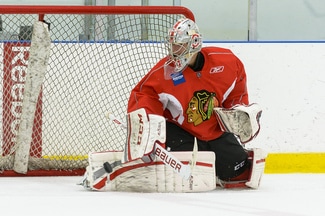
The Stationfy community was a user driven sports forum for athletes, events, brands, and sports fans. The site provided trending sports news, behind the scenes insight from athletes, live event highlights, and live discussions. The MVP focused on MMA with the intent to expand to a variety of sports. This outlet connected like-minded sports fans. To increase the site's engagement, Stationfy sought a better user experience. Their audience demographic ranged from the ages of 16 to 24. We used a responsive design to fit to a larger audience.
|
Over two weeks and three sprints, my three person UX team dove deep into the empathy of sports fans. We conducted research, gained insights, created low-fidelity prototypes, and tested our concepts. Finally, we converged on a unified mid-fidelity prototype in both web and mobile form.
|

|
STARTING PERSPECTIVES
Initial Assumptions
Based on the information provided to us from our kick off meeting, we developed a series of assumptions.

Users valued when content was user-submitted and user-generated
We felt this was a core concept of the platform. Users felt engaged if they had a certain amount of control over what they saw. |
Users wanted to be part of a community of like-minded fans
There were plenty of online communities out there. Stationfy had a specific focus on solely sports. This had potential to attract a loyal group of users who sought interest in sports. |

Users needed to be motivated to engage with the platform
We knew that users were using the platform, but they were not actively engaging with it. Users needed to see the value of engaging. Some possible incentives included gamification tools and user-moderation. |
Research Questions
Knowing this, we laid out a set of broad research questions. We used these questions as tools during the research part of the process.
|
Why did users engage with online communities?
What made users create and/or share content? What prevented users from engaging? |
How did users discuss sports with others?
Where did users find new sports information? |
RESEARCH METHODOLOGY
|
We created a research plan with four main focal areas to validate or invalidate the previous assumptions and find answers to these questions.
|
1. Domain Research
2. Competitive Analysis 3. Usability Testing 4. User Interviews |
|
Domain Research
We wanted as much information as possible about the space that Stationfy exists in. Through our domain research, we analyzed user behaviors on websites and online communities. We also researched the online presence of athletes. This provided us with a better understanding of what exists for sports and online communities.
Using a three prong approach, we diverged the research.
Using a three prong approach, we diverged the research.

The presence of athletes online
Athletes engages online for self-promotion. The biggest platforms were Twitter, Facebook, Instagram, and Snapchat. Fans desired engagement with athletes. |

The successful aspects of online communities
The most successful communities were user-driven and content was self-moderated. Online communities focused on community engagement. |

The reason why people engage in general
I researched the psychological behaviors behind why people engage. Users motivation and participation on a site was depended on how they related to the content. Information was most valid when it offered discussions. This way, users voiced their opinions. |
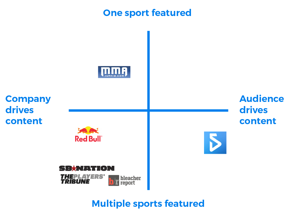
Competitive Analysis
Using a competitive analysis, we looked at potential competitors. We aimed at seeing the values and limitations of other platforms.
Community platformsReddit Product Hunt Quora Youtube Imgur |
Sports platformsSB Nation Players Tribune Bleacher Report MMA Junkie Red Bull TV |
Social media platformsTwitter Snapchat |
The platforms offered applicable insights.
|
User- generated content created successful communities
Users wanted control of the posted content in online communities. Discussions were more active when users felt a personal connection to the posted content. Subreddits were self-moderated. Sites often displayed popular comments/content versus unpopular comments/content. |
Users actively engaged when there were incentives to post content
Product Hunt directed users to promotions or coupons related to the products on the site. Product Hunt users participated in live-chats with influential figures. Popular comments got up-voted on Reddit. Other users saw this and it contributed to that person’s “karma.” |
Users preferred to have multiple modes of interaction
Most user-generated content sites had several ways for users to interact with content (e.g. favoriting, comments, replies, gamification, badges, share function, create content, karma, and points systems). Replying to comments and tagging other members offered additional community interactions. |
|
We gathered common themes and discovered gaps in current sport sites. This opened a potential area for Stationfy to stand out and be different. Most sports companies offered information on a variety sports. Those companies drove and controlled their own content. A site that was user-driven, like Stationfy, was an unoccupied area in the market. We focused on this area as an opportune spot for Stationfy to stand out. |
|
Usability Testing
The goal of usability testing was to understand how people actually thought they used Stationfy. We tested five male sports fans from the ages of 23 to 34 years old. To analyze the current site, we presented them general information. Before testing, we mentioned that this site catered to multiple sport stations, but the site they’d see displayed showed the MMA station. We followed that by asking what do they thought they could do on the website. We recorded and found common themes.
|
Testers understood the feed flow and up/down voting system
The format of content, comments, usernames was recognizable. Testers were unclear what type of content would show when they clicked into the various posts
People didn’t know if the post was a video, picture, article, or social media feed from Twitter, Facebook, or Instagram. There was no differentiation in treatment of content. |
The button functionality caused confusion
There were two follow buttons. One of the buttons had greyed out colors and appeared inactive. Testers did not understand the purpose of following or what they followed. Testers didn’t know if the calendar button was clickable. There was no call to action, no button shape, and no icon giving them that clue. People thought it led to a larger calendar of all the sports events coming up. Some people thought the plus button to create a post provided search options to find other sports. |
User Interviews
|
We talked to people who we identified as potential users of Stationfy. We conducted user interviews to gain insight about the feelings and behaviors of sports fans and their motivations for about online communities. There were four main areas of focus. |
|
1.We wanted to understand what websites people used and how they used them. |
2.We wanted to get a taste of what social media people typically used, what made them share or create content, and how they socialized with other people on social media. |
3.We focused a few questions on one’s relationship and engagement with influential figures online. |
4.Lastly, we strived in determining if and how people access sports content online. |

|
We remotely interviewed 8
sports fans We encouraged the participants to express their true feelings. To ensure comfortability, we told them from the start that there were no right or wrong answers. Our various participants followed a variety of different sports. Some people liked mainstream sports, while some liked more individualized. |
We interviewed 2
subject matter experts Both of these experts taught MMA and one owned an MMA gym. We sought information on how they used social media and engaged in the MMA community. |
We pulled information from the interviews and organized our ideas using an affinity diagram. Through this process, we recognized and found common patterns. We used these patterns to determine six main insights.
Users were more likely to passively engage with a platformsThe first finding represented how people typically engage on their platform of choice. In most cases, this platform referred to Facebook. People "liked" content and pages. Some people browsed comments on posts. Others checked information on group they participated in. Of the people that followed influential figures, they didn’t actively engage or participate.
"I am just aimlessly seeing what's new." |
Users were flexible on how they accessed their contentUsers spent about 50% of their time on their phone and 50% on their laptop. It was conclusive that people valued their phones and computers. The preference came down to what was convenient at the time. This feedback proved important because we intended to have a responsive design.
"I use my phone and laptop 50/50." |
Users sought content that aligned with their interestsPeople wanted interesting content that applied to their lives. Catchy headlines grasped their attention. They enjoyed humorous and fun content. When information went against what the person believed in, they were drawn to read why.
"I am drawn to content if it is something cool, interesting and if I think it is important." |
Users wanted the behind the scenes content
We asked the participants if there was anything they didn’t see in sports content now that they wanted to see. Users wanted more highlight videos, straightforward interesting sports metrics, and additional information on competitors. Also, they wanted the values and benefits of partaking in a specific sport.
"I’d want to access the inside scoop on how well an athlete or a team performs." |
Users relied on newsfeed to provide engaging contentThe people we interviewed didn’t go looking for information. Instead, the information came to them. If they sought interest in a topic, they relied on their newsfeed to provide it. If they wanted more knowledge about the content, then they performed a more specific search. For those searches, people used Google, Youtube, or the Facebook search function.
"Everything significant that I’ve done in the last few years has been through rowing. It organically is in my feed." |
Users expected feedback from content they postedThey expected people to either like, share, or comment on their posted content. Without feedback people felt personally ignored. If no one responded, their opinions about the content changed. It made them feel that their content wasn’t interesting to others. A response provided users with the affirmation that they knew the information they posted about.
"If no one responds, I feel like the content wasn’t interesting to others." |
DESIGNING TO SOLVE A PROBLEM
The wide range of research provided us with applicable insights that we used moving forward. We synthesized the information into a concise problem statement and a set of design principles. This represented the main problem we worked to solve.
The wide range of research provided us with applicable insights that we used moving forward. We synthesized the information into a concise problem statement and a set of design principles. This represented the main problem we worked to solve.
Sports fans need an outlet where they can drive the conversation and have access to unique sports content, so they can feel incentivized to stay engaged in the Stationfy community. |
We focused on a user-driven community where users felt incentivized to participate. The design principles were a set of ambitions we referred to. We kept these in mind throughout the rest of our design process.
1. Active EngagementUsers felt motivated to drive engagement by contributing content and actively participating in discussions. This went back to the insights we discovered. User-driven communities created active communities. When people had personal connections with the content they saw and shared, this incentivized them to continue to participate. They felt validation when people responded to them. |
2. Community FocusedUsers felt part of a community of like-minded people where they could express their ideas and engage with other members. When we talked to our interview subjects, there was hesitation to speak up online. The community needed to be welcoming. Participation needed to be intuitive and comfortable for the user. |
3. Insider AccessThe site provided users with information they couldn’t access on other platforms. There were communities out there that provided users with general sports information. However, none had a singular platform for, what we called, “insider access.” This was personal behind the scenes content about athletes beyond what people normally saw on TV. |
IDEATION PROCESS
|
We moved into the ideation process and kept our design principles in mind to fulfill user needs. Initially we jotted down potential ideas on paper. In order to gain a better understanding of how 16 to 24 year olds engaged online, we researched more articles and websites. They revealed that people used social media to journal their lives.
|
Websites used images and thoughtful content categories to effectively engage with users. We took these ideas and created low-fidelity prototypes using Sketch. We used a 12 column grid to keep the responsive design in the front end of our minds. We exported our pages into three interactive prototypes, using InVision.
|

|
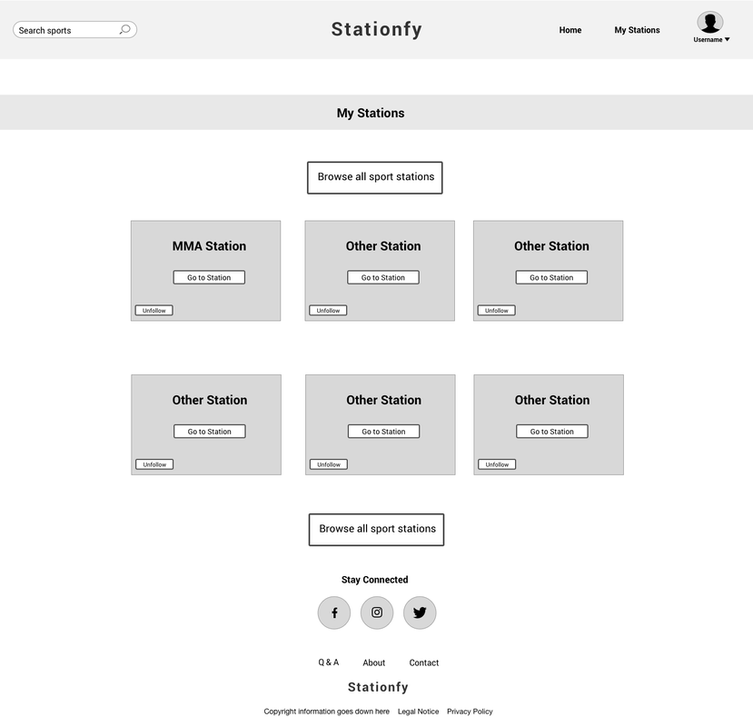
Prototype A focused on giving the user contextual information.This prototype offered suggestions to encourage the user further engagement. It also provided a hierarchy of information.
|
|
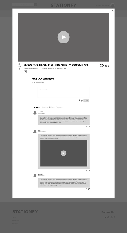
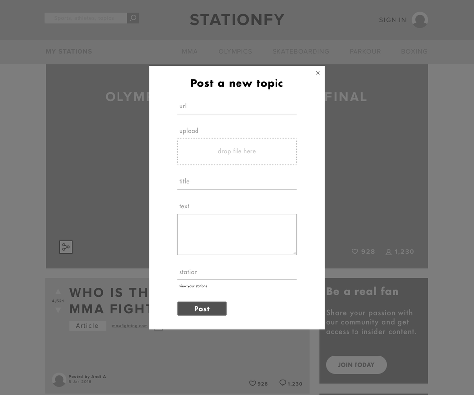
Prototype B focused on large call to actions and engagement tools.The call outs gave users an easy way to create posts. It used familiar patterns for ease of use and also focused on a user highlight creation tool.
|
|
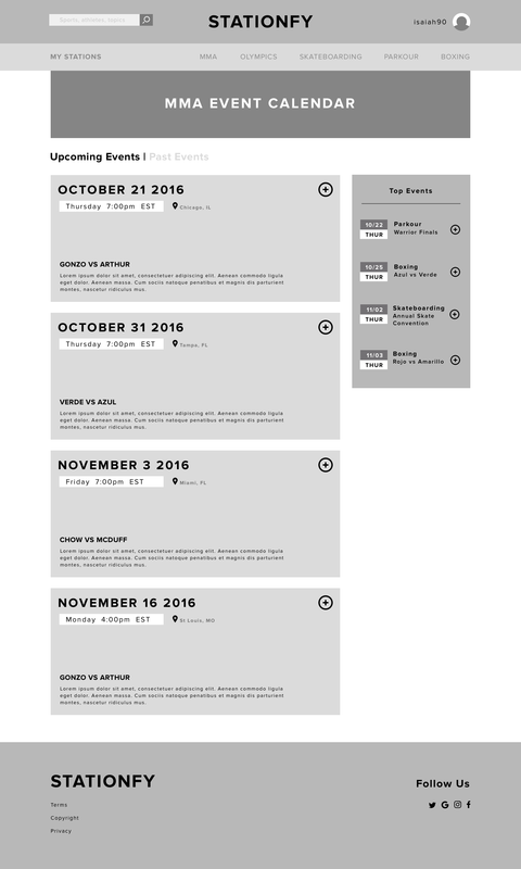
Prototype C focused on user participation outlets.This prototype included interactive methods for creating and viewing comments. It had a simple navigation bar where users accessed the personal stations they followed. There was also a live event calendar screen for live discussions.
|
|
TESTING THE CONCEPTS
|
Upon completion, we tested each prototype to see how users responded to these concepts. It was important that our prototypes offered a sense of community and allowed users to easily engage.
We tested 5 sports fans
All participants were between 19 and 27 years old, males and interested in sports. The interviews took between 30 to 40 minutes. The testers followed a variety of different sports. This allowed us to get a diverse pool of insights. We allowed each participant to freely explore each prototype while voicing their opinions out loud. At the end of each prototype, we asked them about what they thought worked, what didn’t, and what was missing. We noted several common findings amongst our testers. |

|
|
Users had certain expectations about how sports content presented itself on a website, based on what already exists
Most sports websites followed a similar UI pattern and organized their content in similar fashions. Users felt comfortable with these patterns. They found it simple and comprehensive. Prototype A was generally well-received because it most closely followed this idea. |
Users wanted immediate engagement with the content, without looking for it
We found that most users went to a sports related website for a specific reason. They looked up news, checked scores or watched something. Users want to be immediately presented with live information. Clicking through multiple pages caused frustrations amongst users. |
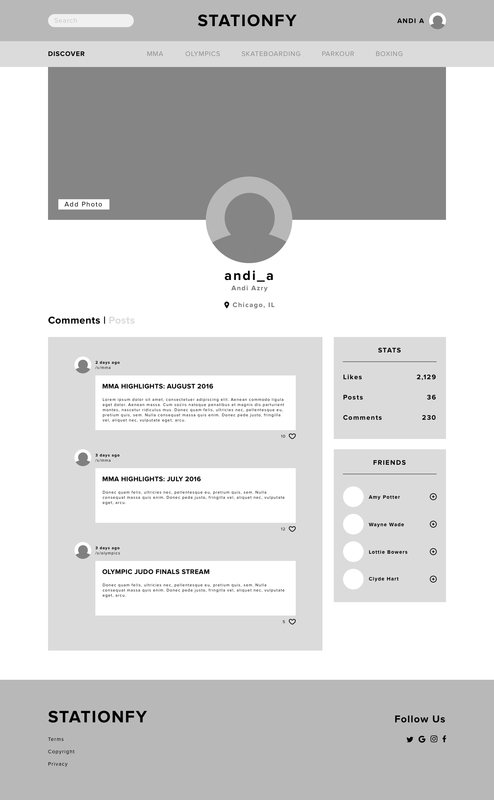
Testing provided inconclusive evidence for the value of a social profile on Stationfy
This referred to the user profiles and the idea of social gamification as an engaging tool. Users did not oppose to the idea of seeing friends or being able to like and recommend posts. However, they did not see great value in it and generally didn’t care about stats related to their activity. |
|
Users were more likely passively interacting with a website
This was a general insight on user behavior. Users appreciated that the prototypes allowed them to easily create and post content, even if they don’t strive to post. Most people were happy to consume sports rather than create the content. Users expected that the sports organizations created the content and there was a disconnection to the idea of user-generated content. |
Users wanted to discover, not search for information
Users appreciated when the platform gave them additional suggested contextual information. This came in the form of recommendations. It encouraged the user to spend more time on the website and enhanced further engagement. |
Users wanted easy access to the stations they follow
This related to both accessing content and our design principle, a community focused platform. Users engaged when they easily accessed the parts of websites that they sought interest in. The navigation of the website played a big part in achieving this because it directed them to content. |
MOVING FORWARD WITH CLARITY
Convergence Process
In general, the insights allowed us a clear idea on how to move forward into our mid-fidelity unified prototype. Prototype A gave users easy access to stations. Users could quickly discover information and it had a familiar sports website look. It also had a community feel. In our final design, we used prototype A as the base. We kept in mind different considerations for the convergence process.

How to immediately engage the user
We needed to carefully plan out the hierarchy of content in a way that most effectively engaged users. |

How could the website stay engaging when there are no live events
While a major call to action was the live events chat section, we thought about an interface flow where there were no upcoming live events. |

How could we track user activity to promote further engagement
Having content category titles such as “recommended for you” or "suggestions" engaged the user. These options catered to the user's personalized interests and resulted in further engagement. |
Sign Up Process
|
It was brought to our attention that the Stationfy site traffic was increasing, however the sign up rate was not. Before we created the final prototype, we honed in on the sign up process. We brainstormed ideas on non-existing users and determined what would make them join the community. To begin, we read articles and gathered different sign up modalities. We sought importance in looking at sites that are community and discussion based. We tested 6 sign up options using 7 people. During the testing we asked simple questions. Which one makes you want to click on it and why? Which one feels the most engaging? Which one would make you want to sign up and why? |
|
|
Users sought big and bold content that caught their attention Users valued friendly content that evoked community |
|
Users valued trust in the service
If the CTA looked like an advertisement or was in the middle of click-through feed, users felt mislead. |
My domain research revealed it was good to have alternating options of engagement at different points in a users experience
We applied this idea to the sign up by having two sign up options. If a user scrolls down, and the CTA to sign up is at the top, it got lost. Then the alternative sign up option appeared. |
|
These insights led us to these two sign up options. Having both options allowed the user constant exposure to a friendly and engaging sign up. The first was big, bold and stood out and when a user scrolled down their feed the second sign up appeared as a fixed footer . |

|

THE FINAL FLOW
Final Design
Using the feedback we received from our previous prototypes and the sign up test results, we converged on a final prototype in both responsive website and mobile form. As stated, prototype A was the base because users found it familiar. It followed an existing sport layout and integrated various social aspects.
General Website Pages
|


Personal Pages
|
Mobile Design
|
We built each of our initial prototypes with the responsive design in mind. During that process, our designs followed the 12 column grid. Because of that, the website version easily transformed into mobile. We used stacking methods to continue the hierarchy of content patterns. For the sign up CTA, we used the fixed footer. The only main difference from site to mobile was the navigation bar. On the mobile this appeared as a hamburger icon.
|
|
FUTURE CONSIDERATIONS
As Stationfy moved forward, we offered future considerations.
|
Explore the value of users having a social profile While we took the social profile into account, there were more implications that needed research and testing. Stationfy needed to make decisions on what went into a user profile page including: having friends, followers, or private messaging. |
Using the fixed footer as a tool to engage users The fixed footer could serves additional purposes after a user signed in. It could continue to engage users by offering article suggestions, include social share options or promote live events. |
Gain knowledge on how to track the activity of the user to promote further engagement It is important to gain knowledge on how to track user activity. This would allow for the recommended sections to exist and may result in further user engagement. |
Gain a better understanding of how the design would look when responsive We determined what posted content looked like in responsive form. However, we suggested further brainstorming on how live discussions and message systems looked. |