Strategizing an engaging sports physical intake form
Presented design strategy | 2023
Patients needed a way to complete their sports physical intake form before their visit so that during their visit, they could maximize the time they spent with the health care provider. Without completing the form prior, the health care professional would need to verbally complete the form with the patient. This being a robust 32 questions form meant that a significant amount of time could be maximized.
To increase the likelihood of patients completing the intake form in advanced, I was tasked with exploring and presenting design strategies that enabled an efficient and engaging form with a fun factor.
To increase the likelihood of patients completing the intake form in advanced, I was tasked with exploring and presenting design strategies that enabled an efficient and engaging form with a fun factor.
OUR AUDIENCE
Our audience consisted of patients in need of a sports physical. With the school year beginning soon, sports physicals were required for elementary school, middle school and high school gym classes and sports. They were also required for sports camps and college sports. Sometimes the patient themselves would be completing this form, however, if the patient was a minor, an adult would likely be filling it out.
ROLES & RESPONSIBILITIES
Collaborate with other disciplines
I collaborated with a cross-functional team at various stages in the process including:
I collaborated with a cross-functional team at various stages in the process including:
- content strategy
- design team
- design management
- product team members
- engineer team members
Gather requirements
I collaborated with the product team to get initial feature requirements.
I collaborated with the product team to get initial feature requirements.
Lead design strategy activity
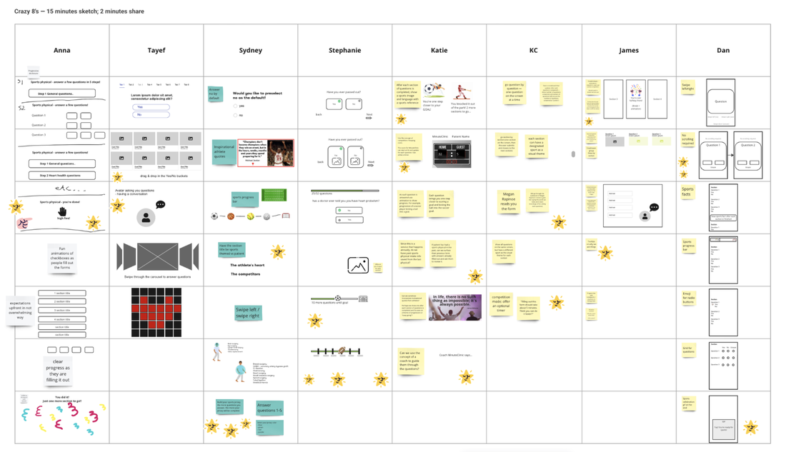
To get our creative juices flowing and brainstorm ways to bring the fun and ease into this 32 question form, my design manager and I set up a design strategy activity called Crazy 8's. I lead the design team through the activity which resulted in 72 total design concepts.
To get our creative juices flowing and brainstorm ways to bring the fun and ease into this 32 question form, my design manager and I set up a design strategy activity called Crazy 8's. I lead the design team through the activity which resulted in 72 total design concepts.
Synthesize activity
Together, my design manager and I synthesized a design strategy activity.
Together, my design manager and I synthesized a design strategy activity.
Create presentation of synthesized results
I worked with the content strategist to determine the best way to set up our presentation.
I worked with the content strategist to determine the best way to set up our presentation.
Present results to the product team
The content strategist and I presented our strategy results to the product team and engineer team
The content strategist and I presented our strategy results to the product team and engineer team
Decide as a team what concepts will go into the form
Together, the product team, engineering team, content strategist, and I made a decision on the best direction to take this intake form based on the presentation insights.
Together, the product team, engineering team, content strategist, and I made a decision on the best direction to take this intake form based on the presentation insights.
SCOPE & CONSTRAINTS
In scope
- Strategize on the best way to lay out the form
- Add a fun factor
- The form must live in the mobile checkin experience. This meant that patients would be completing the form the day of their visit. They could fill it out the day of their visit before arriving at the clinic, or it could be completed while waiting in waiting room.
Out of scope
Even though when it came time to make the form, we knew that we could not change the location of the form, we didn't want this to hinder the activities creative potential. For that reason, during the design strategy activity, we did not mention that anything was out of scope.
Even though when it came time to make the form, we knew that we could not change the location of the form, we didn't want this to hinder the activities creative potential. For that reason, during the design strategy activity, we did not mention that anything was out of scope.
PROCESS
The crazy 8's activity was centered around creativity, rapid sketching, and idea generating. I led the 30 minute activity, which consisted of 5 steps and included 8 members of the design team.
Step 1: Provide context and discuss the problem
To kick off the activity, I shared the main problem we were trying to solve.
To kick off the activity, I shared the main problem we were trying to solve.
- Sports physical season was upon us and we were tasked with creating a form that accounts for school sports.
- Parents and 18+ students would be completing the form.
- Filling out a 32 question before a visit would have a massive impact on saving time with the provider during the visit.
- With 32 questions being a lot, we need to find a way to make the form more fun.
Step 2: Crazy 8's
Next I explained how the activity worked. We had 15 minutes to individually create 5-7 concept sketches. I emphasized that this activity was blue sky thinking -- our creativity had no limit. There was no right or wrong sketch.
Next I explained how the activity worked. We had 15 minutes to individually create 5-7 concept sketches. I emphasized that this activity was blue sky thinking -- our creativity had no limit. There was no right or wrong sketch.
Step 3: Share concepts
We each took 2 minutes to share our concepts. If concepts jumped out at anyone, we identified them using stickers. A lot of designers ran with a sports theme for the fun factor. We also discussed different ways to improve upon some of the concepts.
We each took 2 minutes to share our concepts. If concepts jumped out at anyone, we identified them using stickers. A lot of designers ran with a sports theme for the fun factor. We also discussed different ways to improve upon some of the concepts.
Step 4: Crazy 8's iteration
Next I had each designer iterate on their existing concepts or borrow from others. We spent 10 minutes creating 1-3 more concepts. Designers also had the option to create one complete concept if they wanted to.
Next I had each designer iterate on their existing concepts or borrow from others. We spent 10 minutes creating 1-3 more concepts. Designers also had the option to create one complete concept if they wanted to.
Step 5: Converge
To wrap up the activity, each person took 1 minute to share their final concepts.
To wrap up the activity, each person took 1 minute to share their final concepts.
Together, my design manager and I synthesized the concept sketches. We began grouped common concepts and discovered two main result categories.
Category 1: Fun factors
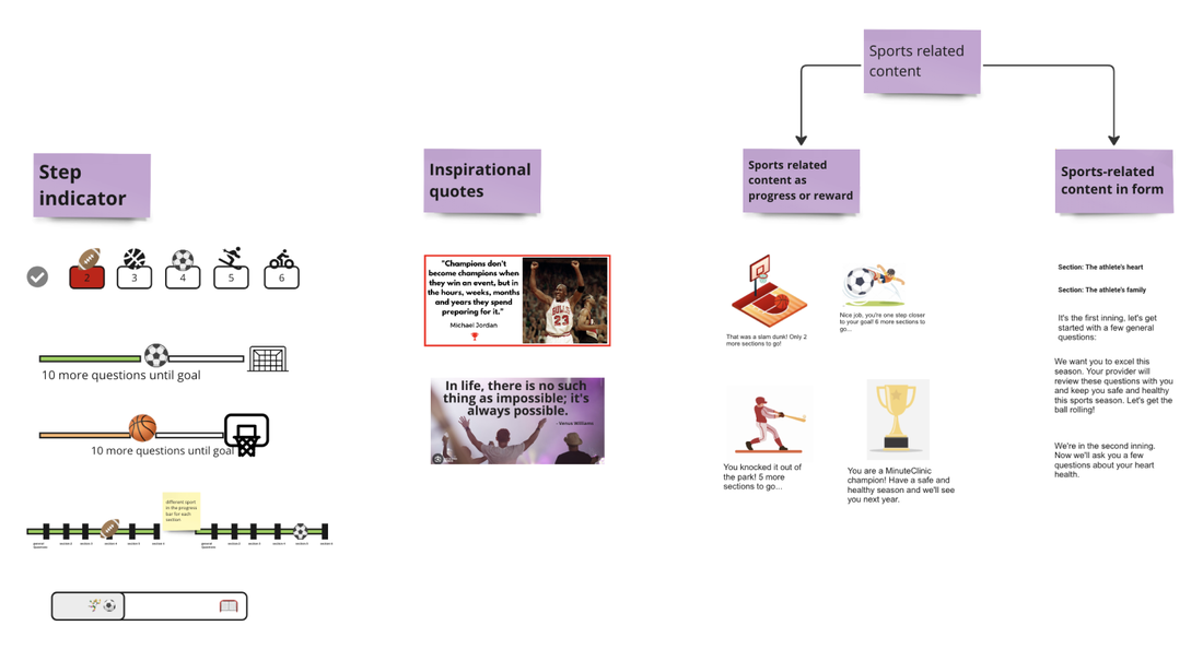
The first category honed in on the fun factor, most of incorporated a sports theme. My manager and I put stickers next to what we thought were either the most feasible or the most fun. These included:
The first category honed in on the fun factor, most of incorporated a sports theme. My manager and I put stickers next to what we thought were either the most feasible or the most fun. These included:
- A sports step indicator
- Sports related content as a form of progress or reward, ie. you're one step closer to your goal (soccer goal), two more sections to go.
- Sports related content embedded in the form, ie. refer to the patient as the athlete.
- Quotes by famous athletes
Category 2: Form breakdown
The second category was about the form breakdown. We noticed a pattern emerge regarding how to lay out the questions. Almost all designers sketched at least one the following form types:
The second category was about the form breakdown. We noticed a pattern emerge regarding how to lay out the questions. Almost all designers sketched at least one the following form types:
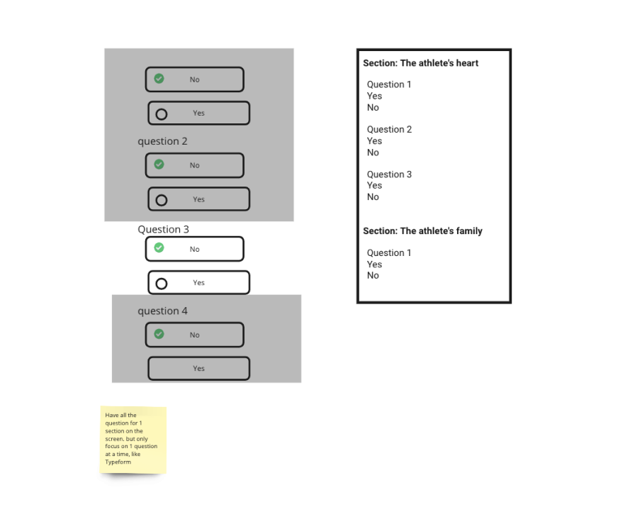
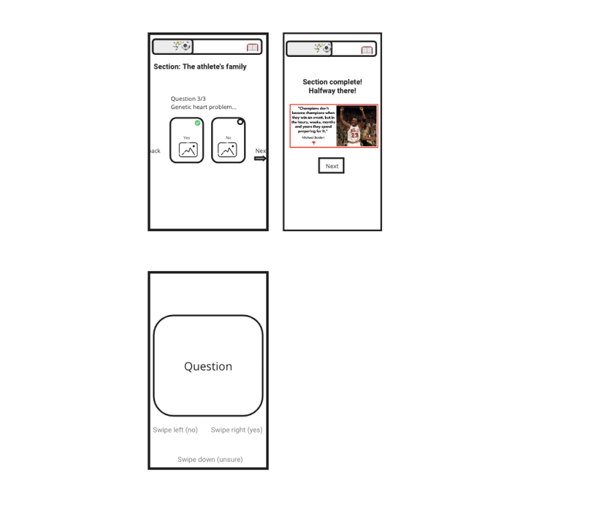
- Fill out the whole form on one page
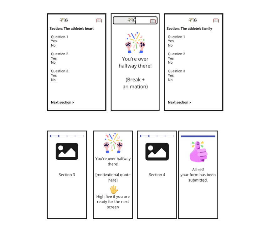
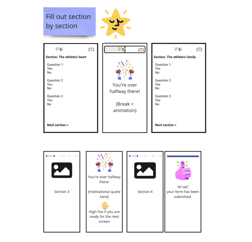
- Fill out the form section by section
- Fill out one question at a time
The content strategist and I brainstormed what would go into the presentation slides. We outlined each slide/section including:
- Reiterating business and design goals of this feature
- Sharing the activity process to help the product team understand how we got to our results
- Sharing our synthesized results for form type
- Sharing our synthesized results for fun factor
- Deciding as a group which fun factors and which form type to move forward with
Look at the pros and cons for the different forms
In past features, the content strategist and I found that when we presented designs with multiple variations, a pros and cons list came in handy.
Before we'd present:
When we'd present:
We utilized this methodology to present each type of form. For the presentation layout, one slide showed the forms side by side. The following three slides showcased each forms pros and cons.
In past features, the content strategist and I found that when we presented designs with multiple variations, a pros and cons list came in handy.
Before we'd present:
- It helped us organize and document our information, knowledge, and thoughts
- It helped us think critically about the potential outcome of each choice
When we'd present:
- It made complex decisions easier to digest for all team members
- It reduced bias by forcing us to examine all sides of the equation
- It created a direct method of comparison
We utilized this methodology to present each type of form. For the presentation layout, one slide showed the forms side by side. The following three slides showcased each forms pros and cons.
|
Fill out the whole form on 1 page
✅ Pros
|
|
Fill out the form section by section
✅ Pros
|
*visit manager accounts for almost everything a patient needed to complete before a visit (consents, insurance, payment info, and non-intake forms)
|
Fill out 1 question at a time
✅ Pros
|
Create an effort and impact matrix for the form types
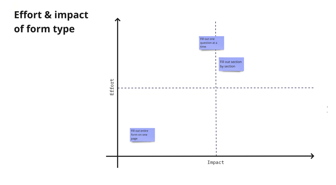
Next, we made a slide showing an effort versus impact matrix. The y axis represented the effort. The higher up on the matrix meant the greater the technical effort. The x axis represented the impact. The further right meant the greater impact.
When we presented, we mentioned how we determined each type of form's placement on the matrix. These included:
- the pros and cons
- knowledge from working on other forms
- knowledge of accessibility guidelines
Decide the fun factors to include
The content strategist and I chose the concepts that were frequently used during the activity. These also happened to be the ones that my manager and I previously thought were either the most feasible or most fun. We laid these out on a single slide.
The content strategist and I chose the concepts that were frequently used during the activity. These also happened to be the ones that my manager and I previously thought were either the most feasible or most fun. We laid these out on a single slide.
Create an effort and impact matrix for the fun factors
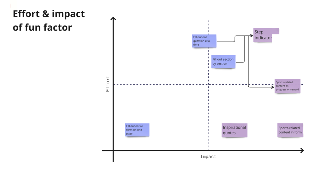
Next, we added a slide with another effort and impact matrix. At first we made another matrix solely for fun factors. However, we realized that the step indicator or sports-related content as progress/rewards would not be options for the one page form. To bring light to this, we combined the type of forms matrix and fun factors together. The arrows showed which fun factors were contingent on moving forward with applicable forms.
Again, we mentioned how we determined each fun factors placement. These included:
- knowledge from working on other intake forms
- knowledge from working on flows with step indicators
- knowledge of working on features that indicate progress
Outcome of the presentation
Although the content strategist and I preferred the section by section form, we intentionally did not reveal this when we were presenting. We did this because we wanted the decision on which direction to go to be a true collaboration. Plus, the other teams may have insights that we hadn't thought of - which could ultimately sway our preference. We wanted true candid feedback and thoughts from the cross-functional teams. And that's what we got! The collaboration was a true success.
|
Fill out form section by section
Both the product team and engineering team suggested moving forward with the section by section form type. The team, as a whole, felt that chunking up the form into sections would be the most digestible for our patients. And, fortunately the PDF of the actual intake form was already categorized into sections, making it easier when it was time to break up the form. They also agreed with the effort versus impact matrix placement - that this form would yield the most impact without too much additional effort. |
|
Sports related content as progress or reward
As a group, we determined which fun factor to go with. First, we needed to decide if we wanted to use more than one fun factor. The content strategist and I weren't partial to how many we would go with or which one/s. We loved all of the ideas. The step indicator was quickly eliminated due to the technical effort being too much. We decided to go with both sports related content for progress/reward and for content in the form. However, the sports related content in the form was contingent on the clinical team giving us the okay to do so. |
After a few days, the product team informed us that the clinical team said that there was no leeway in changing the forms category names or question content. For this reason, our final group decision was to only move forward with the sports related content as progress or reward as our fun factor.
Lessons learned and future considerations
Find a better balance between doing the activity and sharing
One minute to share final concepts felt a bit short. Crazy 8's got its name because it was supposed to be 8 minutes for sketching concepts. Having done this activity a few times in the past, we found 8 minutes was too short. A lot of times less than half of the sketch opportunities were left blank. This time, the boards were almost completely filled, however we felt rushed when sharing. For next time we may want to try distributing times somewhere in the middle.
One minute to share final concepts felt a bit short. Crazy 8's got its name because it was supposed to be 8 minutes for sketching concepts. Having done this activity a few times in the past, we found 8 minutes was too short. A lot of times less than half of the sketch opportunities were left blank. This time, the boards were almost completely filled, however we felt rushed when sharing. For next time we may want to try distributing times somewhere in the middle.
Save our preference until it is group decision time
In some past projects that showcased multiple options, I presented the design preference during the presentation. When it'd be time to decide as a team and other teams were not in agreement with design, it created this feeling of separation. Saving our preference until it was time for everyone to bounce ideas off each other, created a more unified team. Everything has a time and place. Discerning when it's the right time to share may be a case by case situation. However, I was thankful I did for this feature.
In some past projects that showcased multiple options, I presented the design preference during the presentation. When it'd be time to decide as a team and other teams were not in agreement with design, it created this feeling of separation. Saving our preference until it was time for everyone to bounce ideas off each other, created a more unified team. Everything has a time and place. Discerning when it's the right time to share may be a case by case situation. However, I was thankful I did for this feature.
Idioms & accessibility
After the decision was made to use sports related content as progress, the content strategist's manager mentioned that we need to refrain from idioms. Idioms are figurative expressions or phrases that have a meaning different from the literal interpretation of its individual words. Some examples of sports related idioms include:
Because idioms lack precision, they may obstruct our intended meaning. This may put certain patients at a disadvantage and cause confusion. We would need to make sure that sports related content as progress remained clear and comprehensive to our patients.
After the decision was made to use sports related content as progress, the content strategist's manager mentioned that we need to refrain from idioms. Idioms are figurative expressions or phrases that have a meaning different from the literal interpretation of its individual words. Some examples of sports related idioms include:
- You knocked it out of the park
- You've reached the home stretch
- Start the ball rolling
Because idioms lack precision, they may obstruct our intended meaning. This may put certain patients at a disadvantage and cause confusion. We would need to make sure that sports related content as progress remained clear and comprehensive to our patients.


