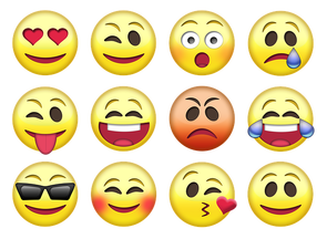
A social events and crowdsourcing app offered users the ability to search for venues and events throughout Chicago. The mobile app provided a real-time rating system of venue vibes using emojis. It also constantly kept users aware of the hottest venues within the users location. The rating system also encouraged users to easily submit ratings. Users explored events happening around them in places they might not otherwise have gone to, such as a corner dive bar or a place they thought wasn’t their scene. In the future, the company planned to implement private event bookings and reservations.
As the UX researcher, I analyzed competitor sites, identified the main users, and learned about social behaviors. Additionally, I created a UX mobile app prototype that fulfilled user needs. I worked alongside a UX designer, UI designer, developer, and project manager. The team provided me with general information to get started. Their ideal audience ranged from 18-35 years old. The intended user loved traveling and exploring new places. The searchable locations on the app included various places, events, and gatherings around Chicago.
RESEARCH QUESTIONS
Based on the provided information, I laid out a broad set of research questions. I used these questions to guide the initial research process.
|
What made a user engage with this social app?
What value did users get out of using this app? What were the company expansion plans? Did they plan to focus just on Chicago? |
How did people plan to see their friends on the app?
How would the emoji reactions influence event appearance? Why would a user choose one event over another? |
BRANCHES OF RESEARCH
I branched the research into four topics. These provided qualitative and quantitative data.
Domain research, gathered information on the decision making processes of choosing an event and information about emojis
Competitors, found who was out there now and how this social app stood out
User interviews, built empathy for the users, understood user expectations
Survey, built empathy for the users, understood social behaviors
ONLINE RESEARCH
Domain Research
The art of decision making
I researched the domain to discover information on how a user would effectively engage with this social app. Also, I gained understanding on how and why a user chose to attend one event over another. In doing so, I researched the art of decision making. There was a vast amount of information on the social app, ie. larger number of venue choices, in depth look at each venue, and ability to connect to friends. By looking at the psychology behind how someone chooses to provide insight towards the best design route to take. Ultimately the goal was to make choosing easy.
Choice theory explained that choices were made to satisfy five basic needs: survival, love and belonging, power, freedom, and fun. It was important that the design satisfied these basic needs. Users safely engaged on the app, loved the platform and opportunities within the platform, felt a part of the community, felt connected to their friends, had the power and freedom to attend the places of their choosing, and had a fun experience.
Rational choice theory explained that individuals chose whichever option maximized their interests and provided them with the greatest benefit. By discovering user expectations on going out in the city, the app would maximize those user interests.
When users made a conscious choice, they preferred the option they had a positive implicit bias for. Bias referred to a judgments about specific things and behavioral tendencies. These affected how people made choices. There were four biases that unconsciously affected decision making.
- Anchoring bias, users “anchor” decisions based around the first piece of information they received.
- Framing effect, the way the choices were presented to users affected how they viewed them.
- In-group bias (the bandwagon effect), when a person in a group acted in similar way to other group member.
- Loss aversion bias, when a person is more compelled to avoid a loss than receive a gain, when users preferred what they already had to avoid missing out.
The more decisions offered, whether simple or complex, the less mental energy and willpower the user has left. The more choices someone had to make, the harder each decision became for the brain, and eventually it the brain looked for shortcuts. A study showed people being exposed to 6 items to taste test versus 24, the customers were 33% less likely to taste test if there were 23 items.
How to make choosing easier
Additionally, I researched strategies on how to make choosing easier. The strategies translated directly to an engaging design style and layout.
Cut, the first rule of thumb was to cut the options down. Less really was more. When faced with choice overload, people were less likely to buy and engage. It was important to find the balance between having enough options to attract users in the first place, but not so many that they became overwhelmed and didn't engage.
Make things concrete, in order for people to understand the differences between choices, they had to understand the consequences associated with each choice. The consequences needed to be emotionally felt. Then users connected with the product on a visceral level.
Categorize, categories prevented choice overload by slimming down the number of options users had to compare to each other. The total number of options to choose from matters less than the number of presented categories.
Condition for complexity, build up from the simple choices to more complex ones to prevent drop off users.
Emojis
I researched the background and benefits of emojis to understand how and why people use emojis.
|
Increased brain processing, because emojis are visual, they effected a different part of the brain. The human eye processed visual/pictorial information more quickly than words. Pictures were shortcuts to comprehension and awareness. Visual imagery was processed 60,000 faster than plain text. Pictures with text increased levels of comprehension and memory that exceeded what is produced by text alone.
Increased brain stimulation, emojis stimulated users on emotional and intellectual levels. They boosted user feelings, whether in a positive or negative way. They were more memorable and more impactful.
|
Competitive Analysis
For a clear idea on how this social app stood out from the competition, I made a competitive analysis. Through this lens of research, I saw what was working and what was not working on competing apps and websites.
Values of competing sitesPersonalized
Easily catered searches and filter functions
Platforms engaged the users with incentives and clear channel communications
|
Limitations of competing sitesLack of consistency
Lack of opportunity
Lack of informaiton
|
GETTING TO KNOW THE USERS
User Interviews
I conducted user interviews to tap into the minds of potential users and to learn their main values and expectations. I interviewed 15 people that liked to go out, enjoyed night life, used smart phones, loved exploring new places, and were active on social media. Their ages fit into the ideal target range, from 18-30 years old. I asked questions regarding three specific areas in a casual and comfortable environment. To prevent bias, I changed the order of questions from one person to the next.
Color associationI wanted insight on a user's feelings associated to certain colors. How did certain colors make the users feel? What was the first feeling that came to mind when exposed to a certain color? Because this social events app used a color based emoji system, it was important that the emoji facial expression matched the intended color. I also wanted information on how often they use emojis and why the use them.
|
Going outI informed the user that I referred to going out as attending a night life event, club, bar, or concert. I sought knowledge on how someone chose to go to a certain place, why they chose one place over another, how they find out about places, and how they want to feel when they go out. Diving deeper, I learned make it or break it factors of going out, thought processes behind changing to a different place last minute, and thoughts and feelings of being at a place and not wanting to be there anymore. Because this app wanted a friend integration, I asked if their friends influenced where they went out.
|
Social mediaI explored the relationship between social media and the users. I gained insights on its impact of user decisions and how often users used social media to discover new places. Further, I looked at which social media app influenced their decisions on going somewhere and what technology platforms they frequently used. Because social media incorporated live events and this app would be in real time, I asked for thoughts and feelings about live events.
|
Surveys
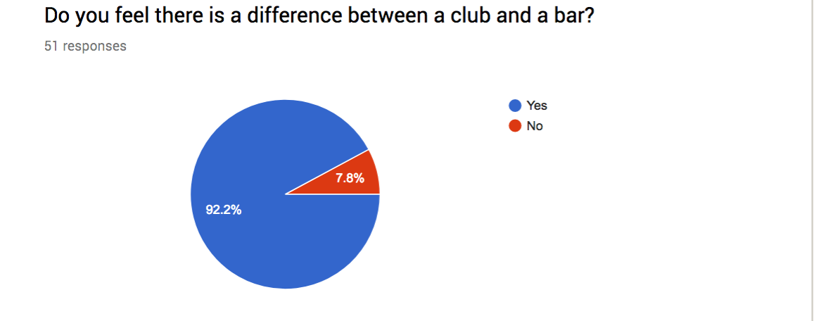
Similarly to the user interviews, I gained knowledge on the above three topics. I pulled the main color/feeling association results from the interviews to receive quantitative insights and to narrow the focus. In total, I had 51 people complete the survey. The survey contained open-ended, yes/no, and multiple choice questions.
USE INTERVIEW AND SURVEY INSIGHTS
Using an affinity diagram, I categorized the interview and survey findings into different sections. I found common occurrences amongst the users.
Users wanted specific physical and emotional experiences when they went out
Physical experience
Users had expectations and values of the physical going out experience
|
Price
Users went to places with affordable prices and drinks.
“I go to the place that is cheaper.”
|
Place
Users went to places that were not too loud or crowded. They based where they went on the location. They expected quality service and drinks.
“I go where the environment is chill and the location is close to home.”
|
People
Users went to places where their friends were. They valued places with respectful people, kind servers, and friendly bartenders.
“I go to where my friends are.”
|
Atmosphere
Users wanted their going out experience to have good music, games, and a variety of interactive and fun options.
“Music determines where I go.”
|
Based on the open-ended survey results, the top make it or break it factors for going out to a certain place included:
- Price
- The type of people there (including age)
- Music
- Volume of venue
- Amount of people there
- Drink selection
Users left an event, bar, club, or venue based solely on physical experiences. The physical experiences triggered them to leave.
|
Price
Users left places when the drinks were too expensive.
“If I walk into the bar and the menu looks ridiculously priced, I go somewhere else.”
|
Place
Users left place where it was too loud to converse with people, too crowded, line to enter was too long, or line to get a drink was too long.
“Why would I go somewhere with my friends if I can’t even talk to them?”
|
People
Users left places if their friends decided to leave and go somewhere else. Users did not go to original place
if friends went somewhere else from the start. “My friends ended up going to a different place so I went with them.”
|
Atmosphere
Users left places with poor music.
“I went to one place and they had horrible music and their beer selection was awful so I went somewhere else.”
|
Emotional experience
Users wanted certain emotional experiences from going out. Amongst the open-ended survey participants and of those interviewed, there were four main emotional categories people expected to feel from going out.
|
Energized/excited
|
Relaxed/chill
|
Happy/positive
|
Fun/free
|
Discovering places to go out
Users often stumbled upon, versus searched, for places they went out to.
“Every now and then a post will catch my eye.” “Technically, I wouldn't be searching, but I may stumble upon a place I may want to go and check out.”
“Every now and then a post will catch my eye.” “Technically, I wouldn't be searching, but I may stumble upon a place I may want to go and check out.”
Users stumbled upon places to go out to via a variety of sources.
|
Facebook
Users were motivated to go to a place that popped into their news feed, that their friend posted about, or when their friend messaged them inviting them to a place.
|
Instagram
Users were motivated to discover a place that looked nice in the Instagram pictures.
|
Word of mouth
Users were inclined to go to a fun place they heard about from friends.
|
Yelp
Users found a place by reading about different places that aligned with user interests.
|
Once a user discovered a place and wanted to go, they relied primarily on Yelp to find out more information.
“I use Yelp to look up a place I've already heard about.”
“I use Yelp to look up a place I've already heard about.”
The majority of users used phones over computers. Over half of those users interviewed and surveyed had iPhones.
Going out habits
Users typically went out 1-2 times per week or 1-2 times per month.
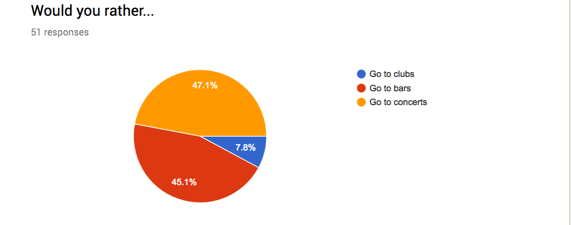
Users went to bars the most of bars, clubs, and concerts.
- Bars: 82.1% went to bars
- 46.2% go 1-2 times per week
- 35.9% go 1-2 times per month
Color insights
First I gathered the color/feeling key words from user interviews. Then I incorporated those words into the survey. This helped me determine the main word feeling associated with each color.
|
Red
Interviews insights
Passion 5/15 33% Warning 5/15 33% All additional results differed Survey insights
Passion 53.1% Warning 37% Key word: Passion
|
Orange/yellow
Interview insights
Happy 6/15 40% Energized 5/15 33% All additional results differed Survey insights
Happy 46% Energizing 34% Key word: Happy
|
Green
Interview insights
Active 4/15 27% Refreshing 4/15 27% All additional results differed Survey insights
Refreshing 57.1% Key word: Refreshing
|
Blue
Interview insights
Chill 8/15 53% All additional results differed Survey insights
Chill 76% Key word: Chill
|
Purple
Interview insights
All results differed Survey insights
Magical 40% Luxurious 30% Key word: Magical
|
Moving forward, I was crucial to determine how the color perceptions translated into the emojis. The goal of the rating system was to have each emoji evoke positive feelings and vibes, while simultaneously being versatile enough to make each place have a unique and stand-out presence.
IDENTIFYING THE PRIMARY USER
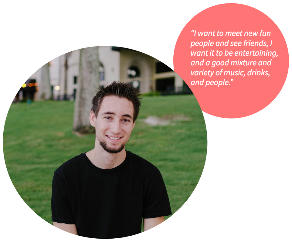
I utilized the synthesized research, I created a persona. Johnny was this ideal model user for this social app. Johnny was a useful reference for future design creations. By considering his motivations and goals throughout the design process, the app met user expectations.
|
Johnny's goals and motivations were to
|
Johnny was frustrated when
|
Preferred Channels
|
AN APP TO SATISFY THE USER
I relayed the research findings and persona over to the design team to collaborate and exchange design ideas moving forward. While my main role was UX researcher, the social app company wanted another designer to create a UX low-fidelity prototype. I incorporated the research findings and tapped into Johnny's goals and motivations through the creation process. Additionally, because the final emoji expressions and color-word associations were still in flux, I left those as blank colors.
Opening screens
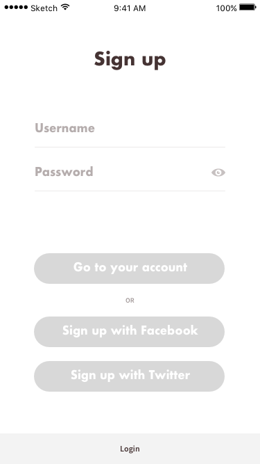
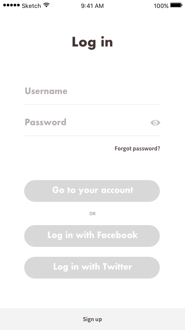
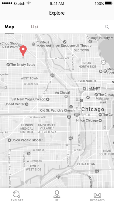
The login in and sign up screens were simple. They catered to users personal and preferred way of joining the app. The opening page went right to a map that showcased the local places. This fulfilled Johnny's goal, to find prime places within his location. Users had an unobtrusive amount of ways to view venues. They had map view and list view. Users also had the opportunity to search for specific places with the search bar. When a user clicked on the location pin marker, the venue information appeared.
Bar or venue information
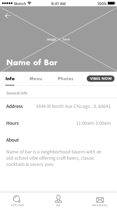
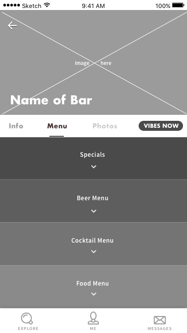
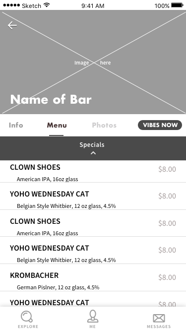
After users clicked the location pin, the venue description appeared. I divided the venue details into three main categories. First, I included general information with the venue address, hours, and a brief about text. The next section had the menu with subcategories including: specials, beer menu, cocktail menu, and food menu. The last category intended to have photos provided by the venue. Johnny valued affordable prices, and this acknowledged that need. Additionally, competitor sites lacked consistent information from one venue to the next. This easy approach removed that limitation. The "vibes now" button was where users checked and submitted the real-time vibes of the venue.
Checking the vibe
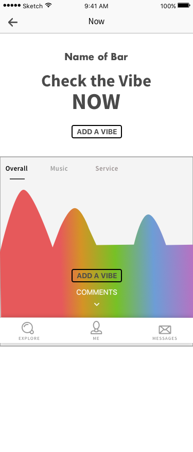
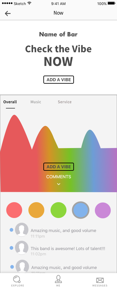
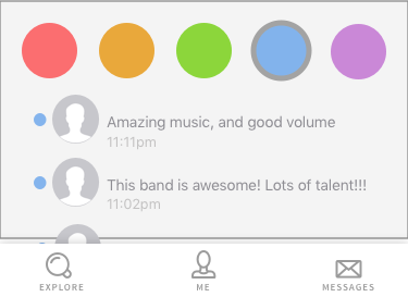
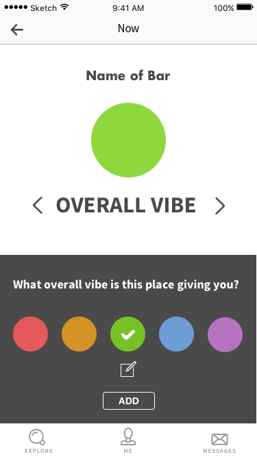
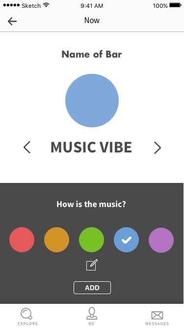
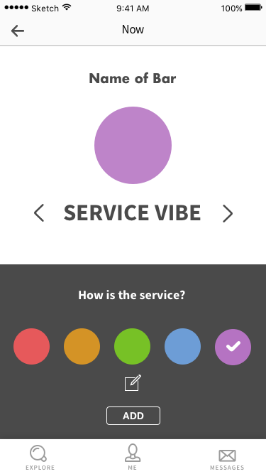
Johnny wanted to discover if a bar/concert matched the vibe he wants to feel prior to arriving there. The check the vibe now section accomplished this. Users could easily check the vibes in real time. Users quickly viewed the trending vibe by seeing the highest color. If users wanted more details, they could view user submitted comments. I divided the vibes into three categories. My thought process in doing this was to cater to specific users without being too broad or too narrow. If there was only one rating system and the user loved venues based on music, they would have to scroll through and hope to find comments about music. If users valued quick and friendly service, they'd have to search through comments as well. By being able to see and rate vibes according to overall feel, music, and service, users quickly checked the vibe they vibed with in an efficient manner.
Different vibe submission options
Users clicked "add a vibe" and the following screens appeared. Each rating category included an "add a vibe" button. Additionally, users could rate all three categories at once by toggling the arrows between the vibe submission screens.
Different vibe submission options
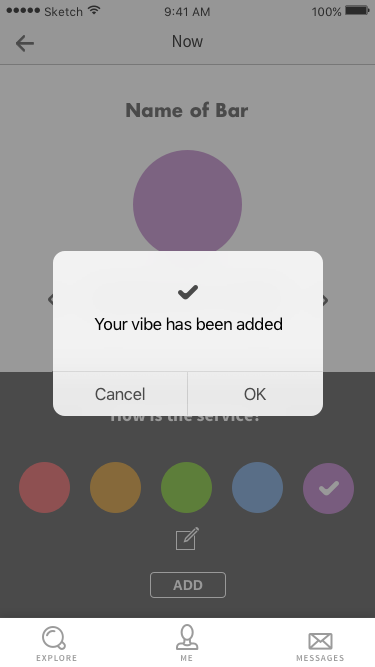
The add a vibe submission had two options. First, users could add an emoji pertaining to the vibe they felt. Second, there was the option to also write a comment. A pop up confirmed a completed vibe submission and that vibe appeared in real time.
FUTURE CONSIDERATIONS
As the social events app moved forward and my internship wrapped up, it was crucial that the team kept in mind the following considerations.
Finalize emojisThe company needed finalized decisions on which emotional key word and color represented each emoji. I recommended potential on boarding methods to explain what each emoji meant for clarity and introduction purposes. Additional tests would able be beneficial.
|
Connecting friendsThe app wanted to provide opportunity for friends to connect via message systems. It also wanted to display on the map what events friends were attending. This area needed additional prototyping and testing to ensure that it was beneficial and also user friendly.
|
ReservationsMaking reservations was an additional feature the company wanted to implement. Conversing with venues, creating venue integration systems, building a venue specific app was the direction to consider when incorporating this feature.
|
User engagementWhile the user engagement tools and user submissions were created in the initial prototypes, it was important to constantly keep in mind that this part of the design needed to be extremely easy and as engaging as possible.
|
Photo from David Vega Fotografia

