
Mood boards, typography, & brand identity
Infiniteus Rocks & Juice
a brick and mortar with a digital shop featuring multi-faceted products:
Project goal: Having perviously defined the company's persona, design principals, and digital functional flow, I moved to the UI portion. It was time to determine the brands overall digital essence. Learn the full design process for Infiniteus in my case study.
- health foods and supplements
- organic juices and juice cleanses
- crystals and spiritual tools
Project goal: Having perviously defined the company's persona, design principals, and digital functional flow, I moved to the UI portion. It was time to determine the brands overall digital essence. Learn the full design process for Infiniteus in my case study.
|
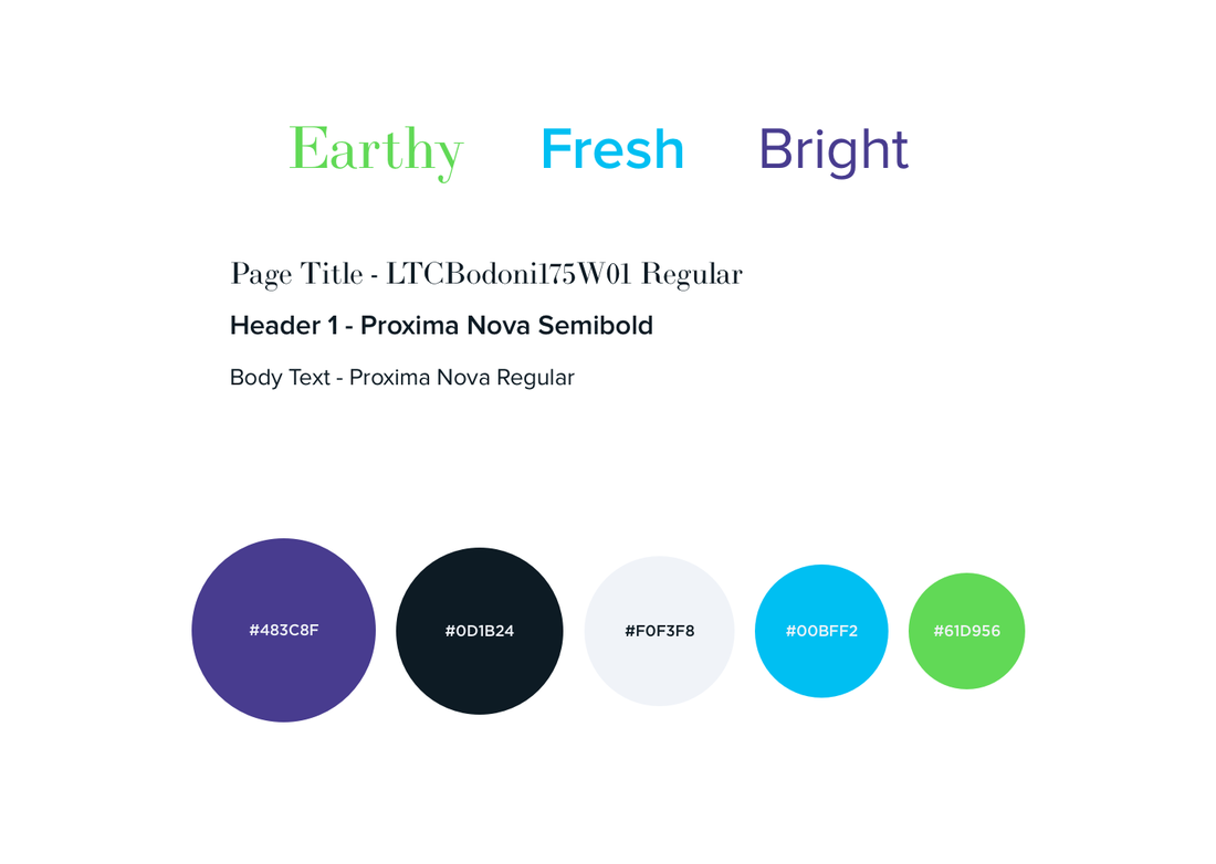
Each mood was inspired by the user research and UX work I had previously accomplished for Infiniteus.
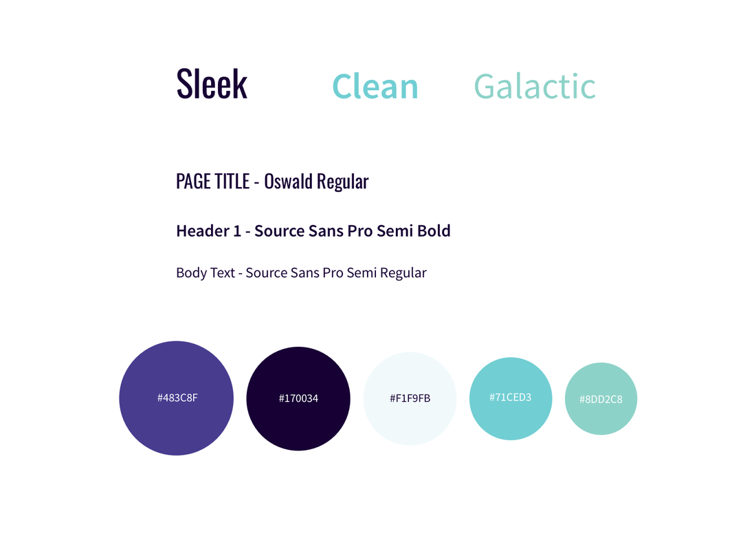
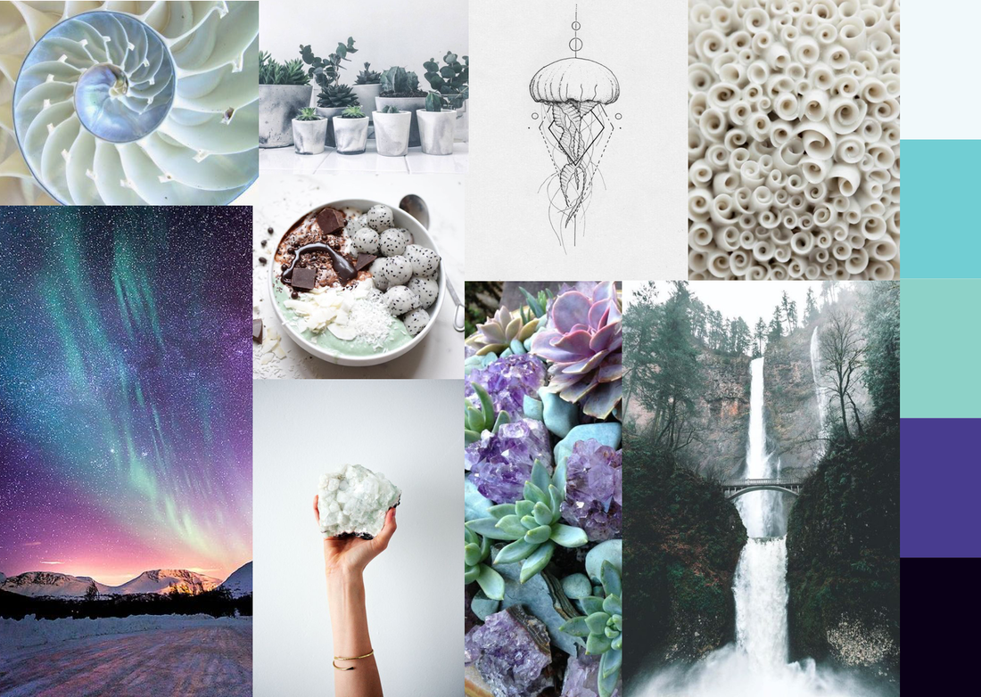
Mood board 1
The first mood board was inspired by the design principle, concise. Users wanted information to be straight to the point. They also valued a clean and clear experience when shopping. The colors and images were sleek and clean. I chose the Oswald font because of its new take on the classic gothic fonts. It brings new life to an older font style. Similarly, the intention behind Oswald related to crystal usage. Today, new age cultures were using ancient crystals and healing methods as health conscious tools.

|
|
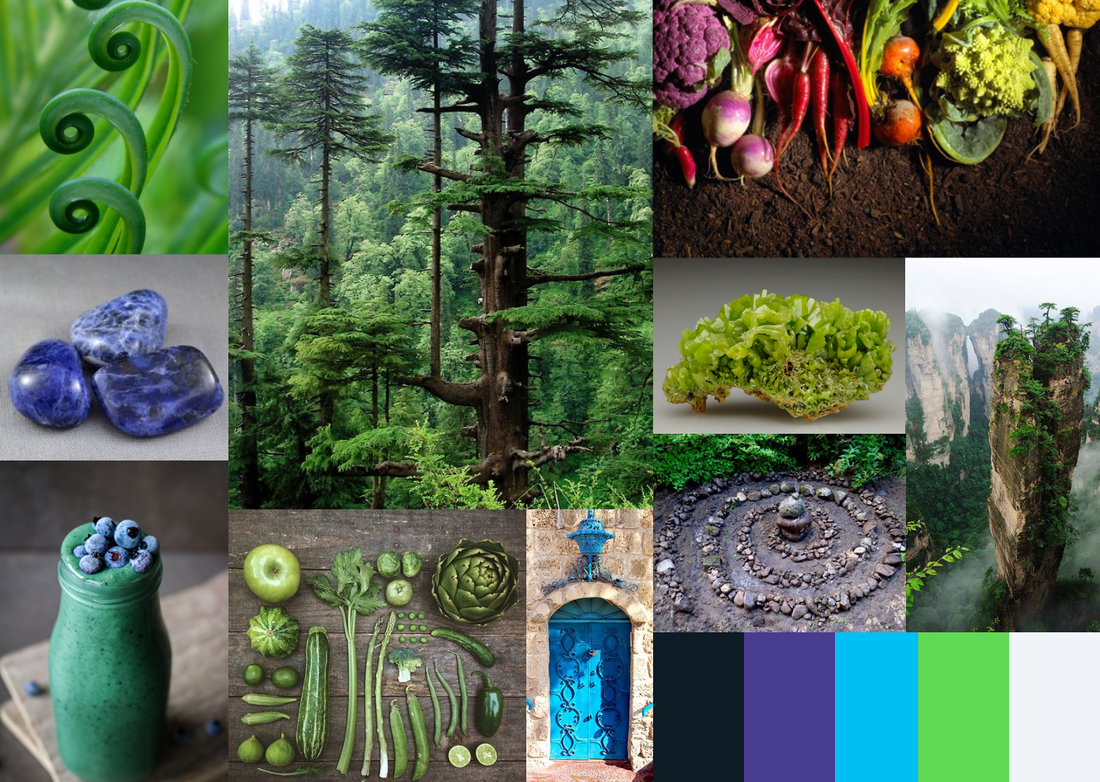
Mood board 2
The second mood board was inspired by the design principle, personal. The fonts and colors were warm. They invited the user to gain knowledge and wisdom when using the site and about the intended products. Raleway was an intriguing font that offered a sense of discovery and connection.
|

|
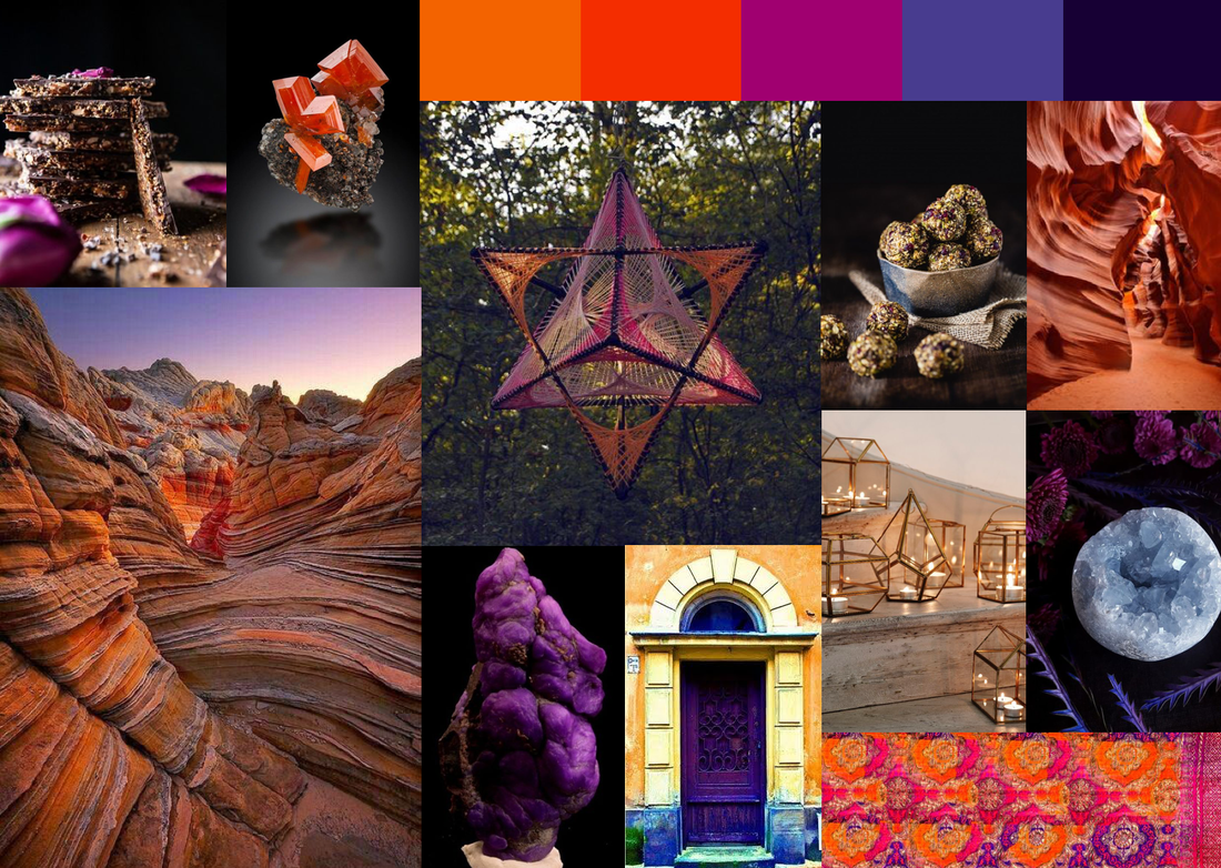
Mood board 3
The third mood board was inspired by the design principle, connected. Users wanted to feel connected to the community and to the products. By having natural images of Earth, the user instantly felt connected. The images also aligned with Elliot's earth conscious goals. Proxima Nova was a humanistic font, that simultaneously offered a sense of individuality and collectivity.
|
|
|
I conducted a survey to determine the look and feel. To focus in on the best choice, I sought knowledge on both the mood boards and the color combinations. The questions related to Elliot's values, the design principles, and the problem statement. This ensured applicable and useful results. At the top of the survey, I stated the survey was anonymous. The intention was to match images and color combinations with words that felt the most appropriate.
|
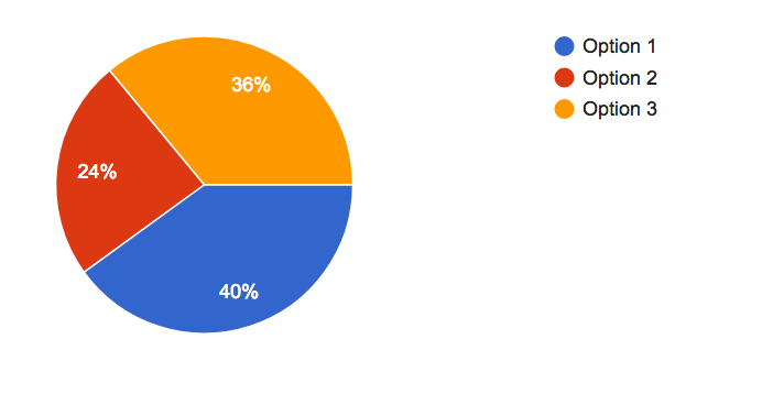
Color combinations
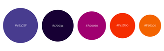
Option 1
|

Option 2
|
Option 3
|
|
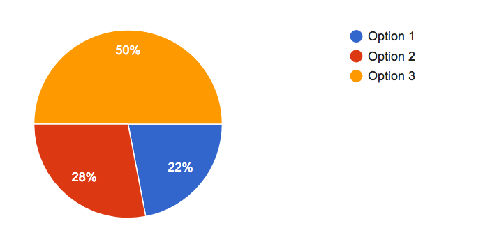
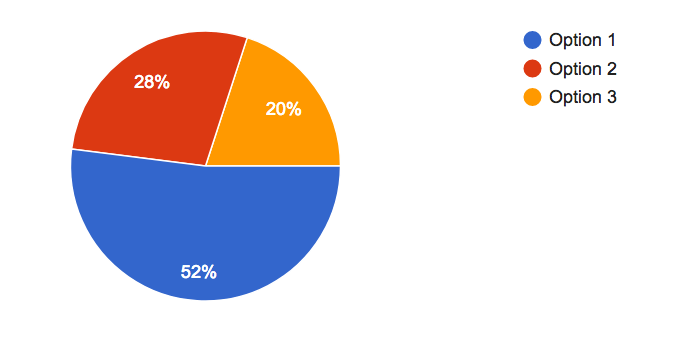
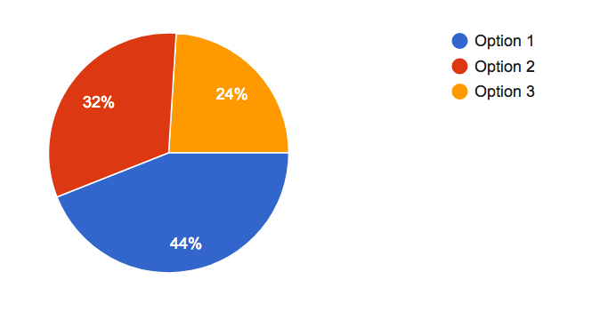
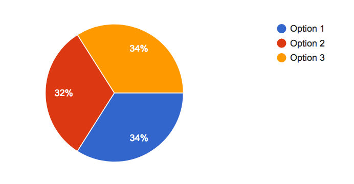
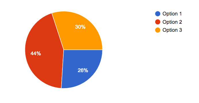
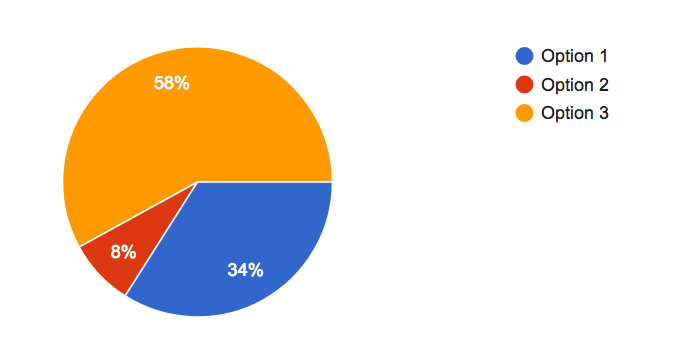
Which color combination feels the most trustworthy?
|
Which color combination feels the most inviting?
|
Which color combination makes you feel like you are a part of a community?
|
Mood board combinations
This section of the survey stated that the images groups below represented the potential look and feel of a conscious health products and metaphysical online shop. The results were very versatile.
Option 1
|

Option 2
|

Option 3
|
|
Which option makes you feel like you will expand your consciousness?
|
Which option feels the most inviting?
|
|
Which option feels the most trustworthy?
|
Of the three options, which option is your favorite?
|
The final question was: Why is the option your favorite?
The answers to the open ended questions from options 1 and 3 directly pertained to Elliot and the design principles. Option 2 had conclusive answers, "I like the colors."
|
Option 1
|
Option 3
|
|
|
I analyzed the survey answers and decided on the site's final look and feel. Even though the most inviting and connected color combination was option 1, I choose to work with the color combination that proved most trustworthy. The mood board had mixed results. Mood board 3 proved most trustworthy. Trustworthy was a design principle, a part of Elliot's values, and important to solving the main problem. Users felt mood board options 1 and 3 expanded their consciousness. These related to the design principle connected because expanding consciousness literally means entering into new dimensions of connectedness with others. Finally, the reasons why users favored mood board options 1 and 3 also correlated to the design principles. As a result, the final look and feel, incorporated a combination of both mood boards 1 and 3.
|

|
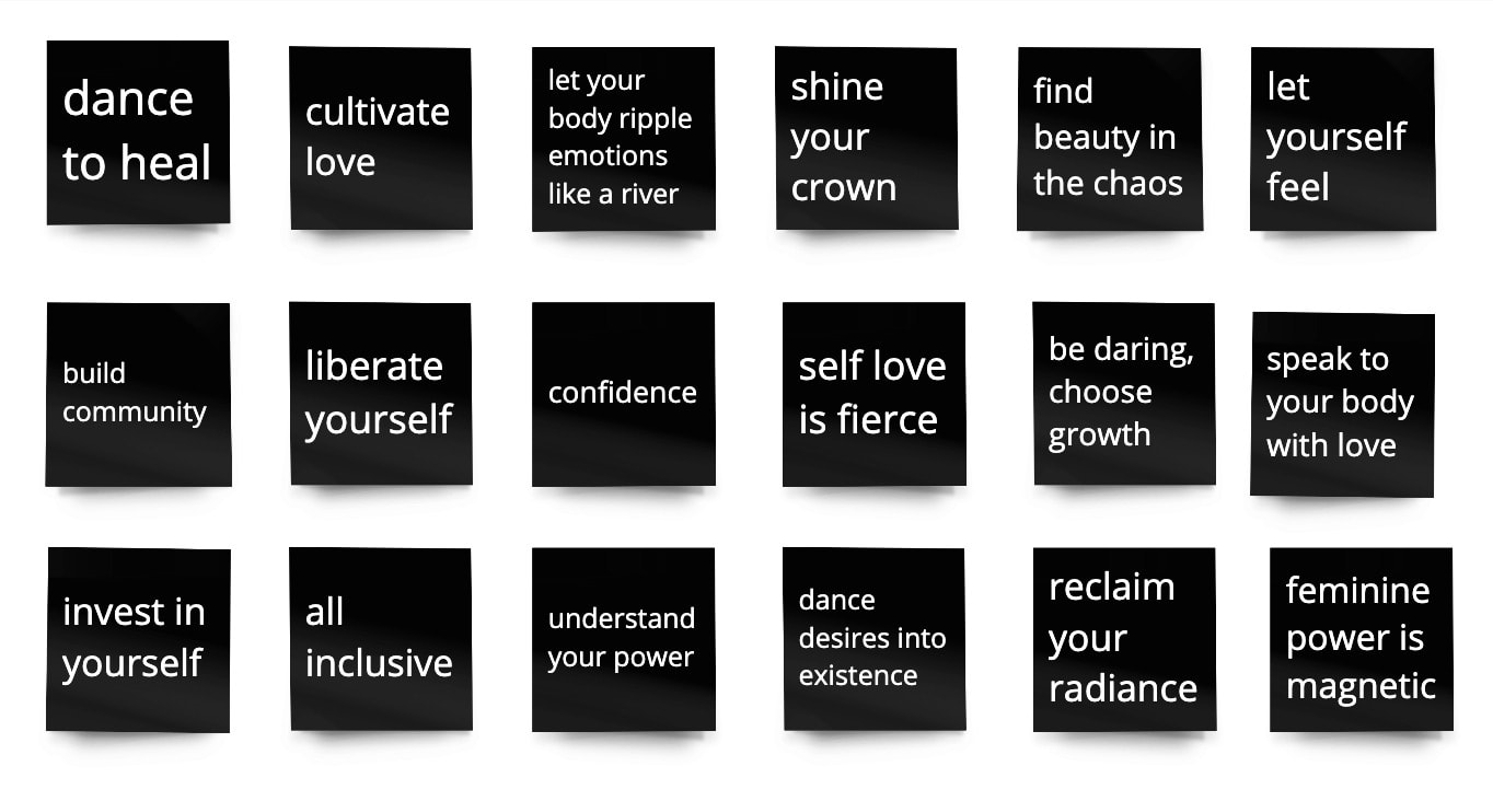
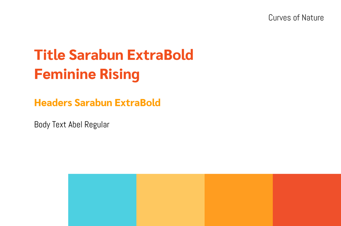
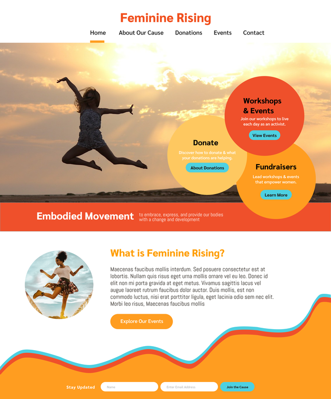
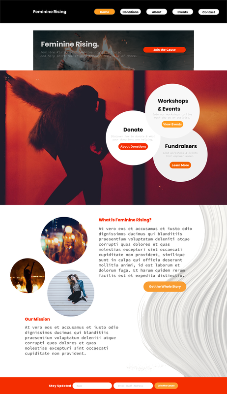
Feminine Rising
A company helps bring empowering feminine dance and movement practices to women whose financial, social or personal circumstances have marginalized or oppressed them.
Project goal: Create brand identity with colors, typography, and overall essence
Project goal: Create brand identity with colors, typography, and overall essence

|
This project started with determining the brand's digital look and feel. I met with stakeholders to understand the companies mission. I jotted down notes of keywords, quotes, stories, and began the creation process.
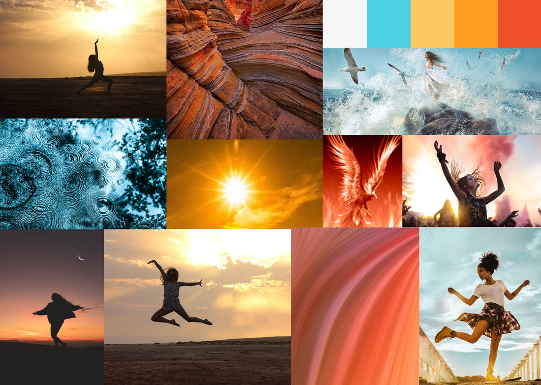
Mood board 1 | Curves of Nature
For the first mood board, I was inspired to incorporate the curves found in nature to represent the curves found in our bodies and in the movement of dance. Let your body ripple emotions like a river was a note I had taken. The images with the sun symbolized looking towards the future, or sun. Some of these show shadowed images of dancers to reclaim their radiance.
Typography
Sarabun
Sarabun
- translates to “documentary affairs”
- clean and modern
- became a free to stimulate worldwide development of collaborative font projects
- edgy and unique
- great for the body text on web
|
|
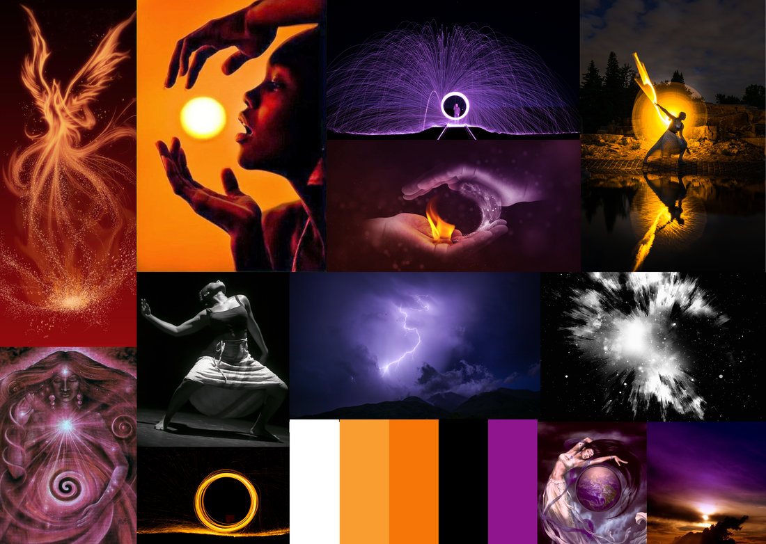
Mood board 2 | Dynamic Divine Feminine
The second mood board was inspired by liberating oneself and connecting to the divine feminine. The images are explosive and provide a sense of release, passion, and empowerment. I wanted you to be able to feel the energy from the photos which referred to the note to let yourself feel.
Typography
Staatliches
Staatliches
- Clean, sharp, unique
- One of the most important influences on graphic design in the twentieth century.
- Designed to rescue the special beauty of the past and pull that uniqueness into the future
- Designed to be strongly humanistic
- Has a quirky, unique, fresh feel

|

|
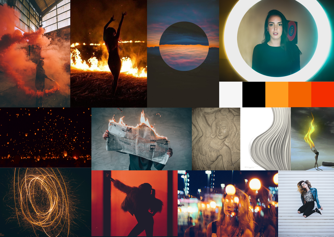
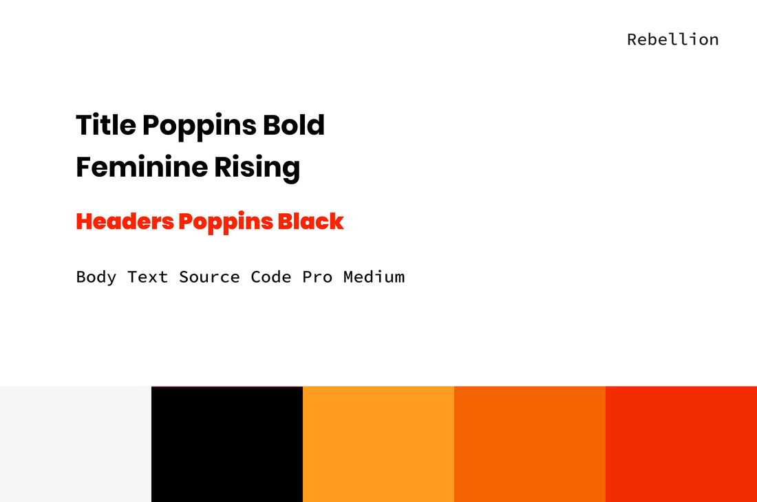
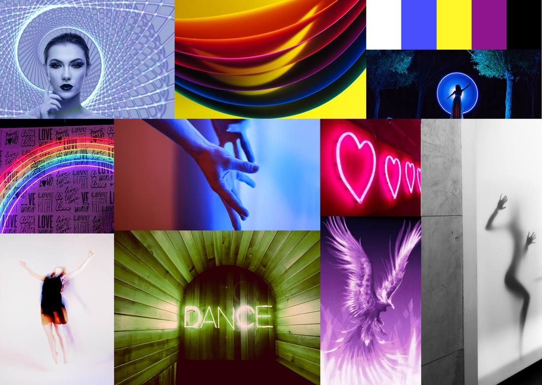
Mood board 3 | Rebellion
The third mood board highlights being daring and fueling oneself with hope and confidence. Burning paper can represent letting go of the past and fueling hope for the future and rising out of the ashes.
Typography
Poppins
Poppins
- Designed and based on pure geometry, particularly circles --- circles are often associated with feminine energy
- Capturing the long tradition of geometric typefaces in a new and improved way
- Reflects the historical typewriter --- to highlight the past
- Designed for coding environments --- metaphorically coding one's path forward
|

|
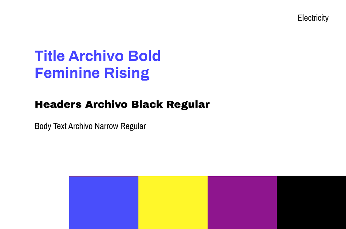
Mood board 4 | Electricity
The fourth mood board conveyed the electricity one feels when they dance. The images bring motivation, excitement, energy, and inclusivity.
Typography
Archivo // Archivo Black // Archivo Narrow
Archivo // Archivo Black // Archivo Narrow
- great across web and print for high performance
- designed to be aesthetically pleasing yet practical
- reminiscent of the late 19th century “the progressive era”
|

|

|
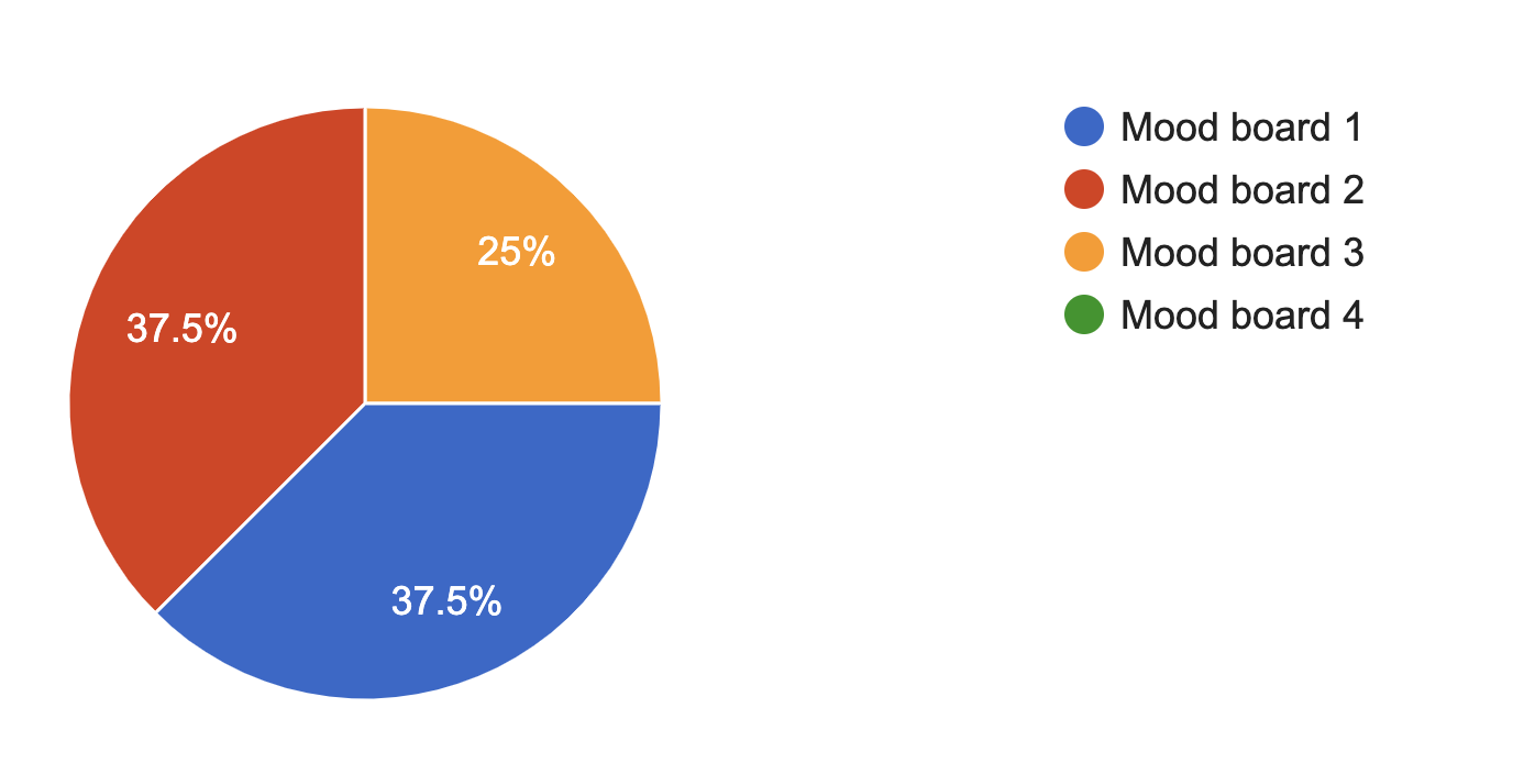
I surveyed 50 people to determine the look and feel. To ensure applicable and useful results, the questions related to Feminine Rising's goals and values. I sought insights with two main focuses.
- the mood boards
- the prototypes
Mood board survey questions

Mood board 1
|

Mood board 2
|

Mood board 3
|

Mood board 4
|
|
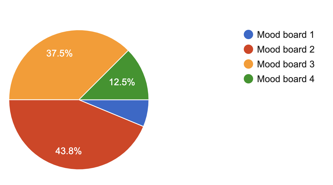
Based on the four mood boards above, which one makes you feel the most passionate about embracing your femininity?
|
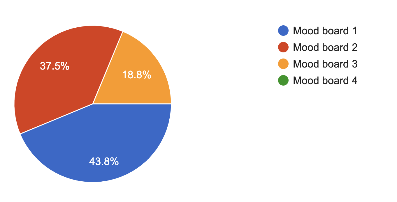
Based on the mood boards above, which one makes you feel like you want to rise up and change gender stereotypes?
|
|
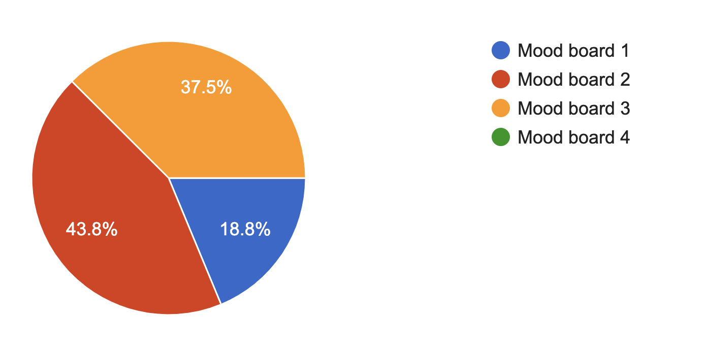
Based on the mood boards above, which one makes you feel the most embodied (connected to your body)?
|
Which mood board is your favorite?
|
Prototype survey questions

Prototype 1
|

Prototype 2
|
Prototype 3
|

Prototype 4
|
|
Based on the prototypes above, which one makes you feel the most excited for changing gender stereotypes?
|
Based on the prototypes above, which one feels the most inclusive of all women, lgtbq+ai, etc?

|
|
Based on the prototypes above, which one makes you feel ready to accomplish something?

|
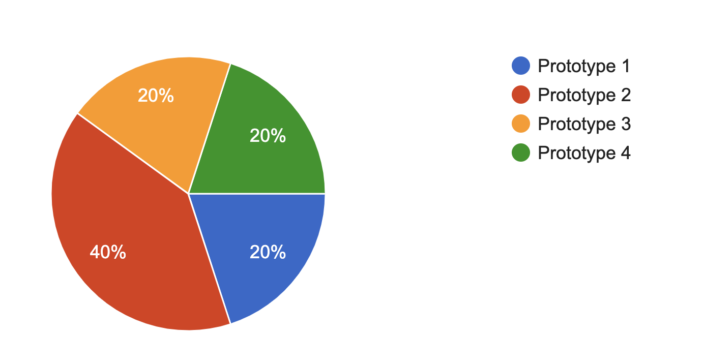
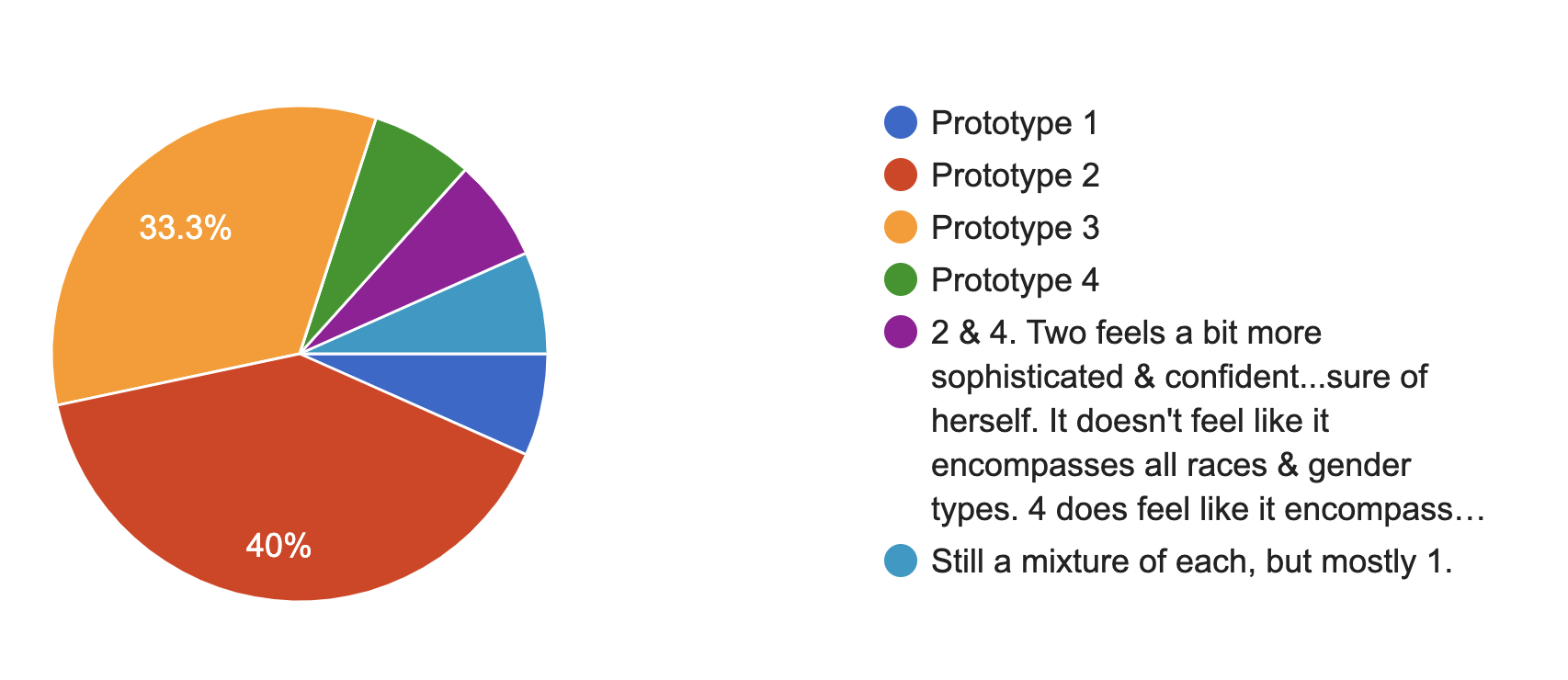
Which prototype is your favorite?
|
|
|
The end results had a pretty clear winner. For almost every question, option 2 was the top or at the top of the votes. We decided to move forward with option two as the look and feel of the brand and site.