
ROLES & RESPONSIBILITIES
Collaborate with cross-functional teams and disciplines
I collaborated with cross-functional teams and other disciplines including:
I collaborated with cross-functional teams and other disciplines including:
- product team
- business team
- clinical team
- engineering team
- research team
- content strategist
- accessibility designer
Analyze the current mobile checkin experience
- I analyzed qualitative data analytics using Medallia.
- I analyzed quantitative data using Adobe Analytics for page usage statistics and Quantum Metric for patient interaction statistics.
- I recorded observations of current mobile checkin screens.
Recommend ways to optimize mobile checkin
Based on the analytics, I found and recommended mobile checkin improvement areas.
Based on the analytics, I found and recommended mobile checkin improvement areas.
Conduct a priority order guide activity
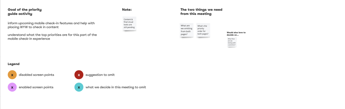
The page variations included in my optimization suggestion consisted of information/requests from a variety of teams. To determine what would be the priority order from top of the page to the bottom, I created a priority guide activity. This aligned all the different teams and gave us clarity on which order we should prioritize each component on the page variations.
The page variations included in my optimization suggestion consisted of information/requests from a variety of teams. To determine what would be the priority order from top of the page to the bottom, I created a priority guide activity. This aligned all the different teams and gave us clarity on which order we should prioritize each component on the page variations.
Usability testing
To ensure the new design and priority order was comprehensive, and considering the high stakes of these crucial screens, I conducted usability tests with support from a member of the research team.
To ensure the new design and priority order was comprehensive, and considering the high stakes of these crucial screens, I conducted usability tests with support from a member of the research team.
Deliver high fidelity screens
I presented the new page variations to stakeholders, product leaders, engineering leaders, and multiple design teams. I iterated on some feedback and handed off the designs in high fidelity.
I presented the new page variations to stakeholders, product leaders, engineering leaders, and multiple design teams. I iterated on some feedback and handed off the designs in high fidelity.
Update user flows
After the hand off was complete, I updated the user flow to account for the new mobile checkin page variations and experience.
After the hand off was complete, I updated the user flow to account for the new mobile checkin page variations and experience.
SCOPE & CONSTRAINTS
In scope
Focus on two variations of the checkin page including:
Deliver high fidelity designs
Focus on two variations of the checkin page including:
- Mobile checkin (disabled) variation, when it was too early to checkin
- Mobile checkin (enabled) variation, when it was time to checkin
- Product: Make the checkin (disabled) button and checkin (enabled) button aligned on the page so that when the page automatically refreshes, the buttons line up, also add an intake form onto the checkin (disabled) variation to give patients something to do while they are waiting (WYW)
- Business: replace the kiosk with mobile check in, provide a way for patients to cancel or reschedule the visit to reduce wasted visits
- Clinical and legal: provide specific content on each page variation
Deliver high fidelity designs
Out of scope
Make changes to the visit details component within the page variations. It was owned by a different product team. However, we could remove the component if it felt like the right move.
Adjust any text message notification or email content. Although one of the main entrances into mobile checkin was through text, it was also owned by a different product team.
PROCESS
|
This feature came to light based on a previous feature I worked on called 'Mobile Checkin Optimizations'. Using a variety of qualitative and quantitative analytic software applications and observations, I found multiple opportunities to improve the mobile checkin experience, increase customer conversions, and solve for pain points. This case study focuses on two of many recommendations I brought to light.
Optimizing mobile checkin (disabled) page variation, when it was too early to checkin
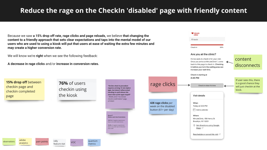
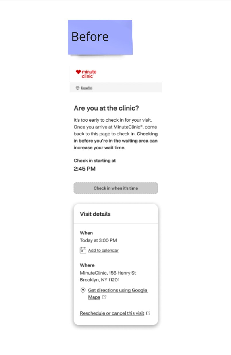
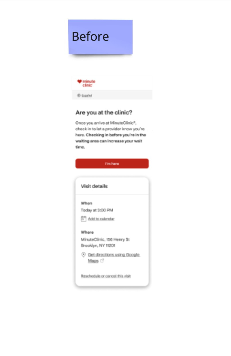
The checkin (disabled) page was the page variation that patients saw when it was too early to checkin. This variation experienced a large number of rage clicks and a high drop off rate. It also had content uncertainties. For example, it said 'come back to this page' when it is time to checkin, however it didn't explain how to come back.
By providing an experience that set clear expectations, we hoped to decrease rage clicks and drop offs and increase conversion rates
Optimizing mobile checkin (enabled) page, when it was time to check in
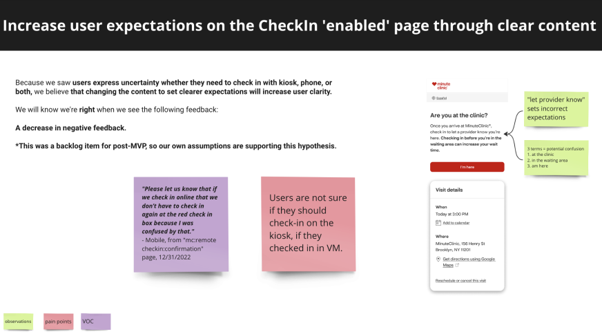
The checkin (enabled page) was the variation patients experienced once it was time to checkin. I gathered feedback directly from our patients using the qualitative analytics voice of customer (VOC) platform, Medallia. I found that numerous patients were confused as to whether or not they still needed to use the kiosk after checking in from their mobile device.
I also found content that may cause confusion. The clinical team wanted patients to check in once they were in the waiting area, however the content referenced multiple places:
By providing an experience that set clear expectations, we hoped to decrease customer confusion.
The checkin (enabled page) was the variation patients experienced once it was time to checkin. I gathered feedback directly from our patients using the qualitative analytics voice of customer (VOC) platform, Medallia. I found that numerous patients were confused as to whether or not they still needed to use the kiosk after checking in from their mobile device.
I also found content that may cause confusion. The clinical team wanted patients to check in once they were in the waiting area, however the content referenced multiple places:
- Are you at the clinic?
- Check in once you arrive at MinuteClinic
- Be in the waiting area
- The button said 'I'm here'
By providing an experience that set clear expectations, we hoped to decrease customer confusion.
|
There were a lot of information/requests coming in from different teams. To determine how to configure everything, I created an asynchronous priority guide activity. First, I broke up each page variation into the different pieces.
Mobile checkin (disabled)

Mobile checkin (enabled)
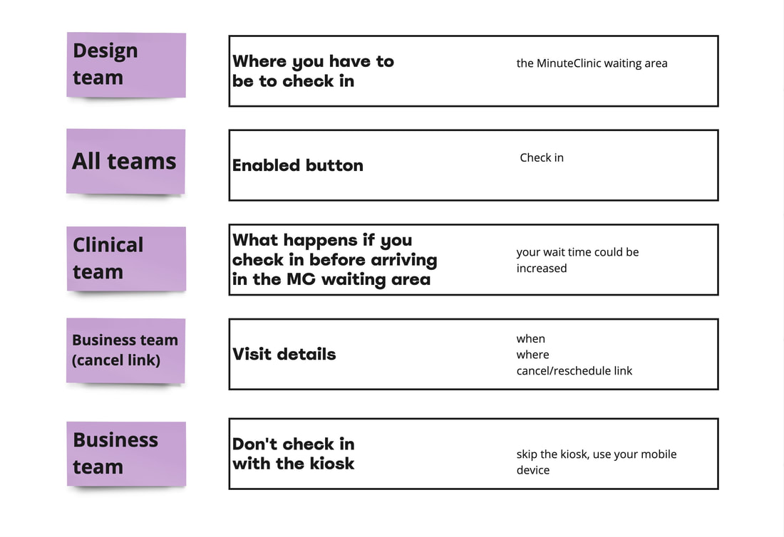
Next, I created sections for each participant to rank each part from most important to least important. I included members from a variety of teams so that we had a lot of different perspectives including: product, clinical, research, design, business, accessibility, content, and design leadership. I asked that each person leave notes along the way if anything stuck out to them. Rather than all of us do the activity at the exact same time, I let each person do the activity whenever they had time over a three day period. Once someone was done, they hid their selections to prevent bias.
|
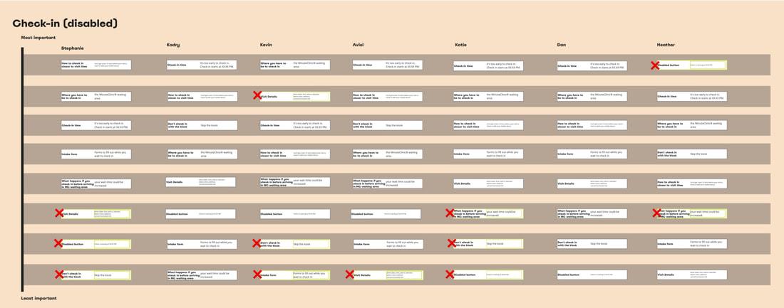
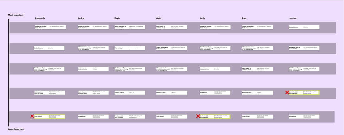
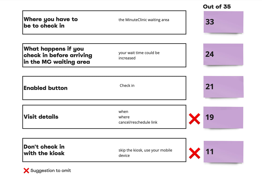
To determine the priorities, I took each persons priority order and created a chart. Then I whipped out some math skills. I gave the top priorities the highest value and lowest the least. One very interesting find was that a lot of participants noted to omit certain options.
Mobile checkin (disabled)

Mobile checkin (enabled)
|
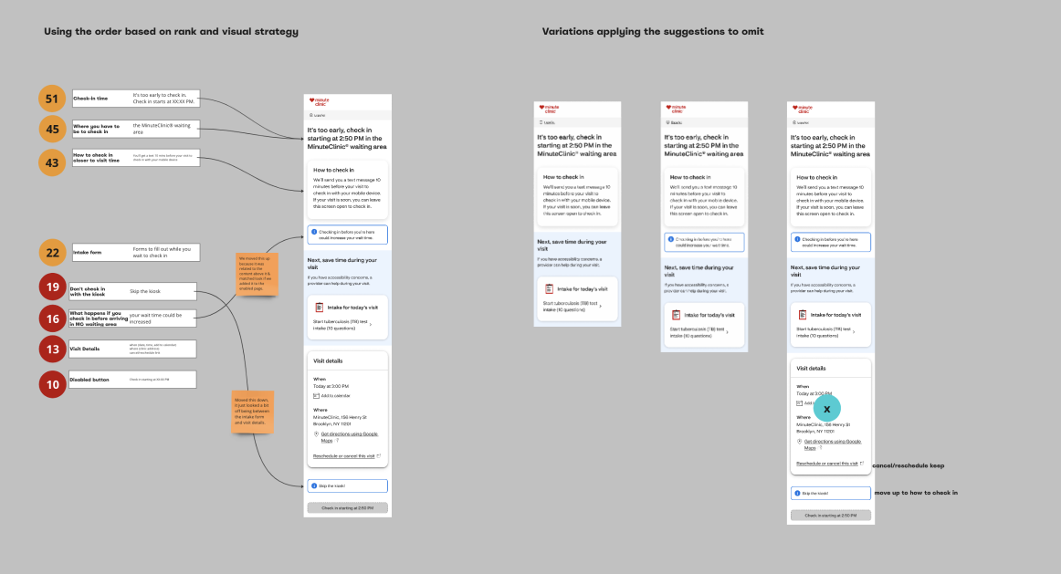
Now that the activity was synthesized and there was a priority order formed, I created components. Each component represented a priority item. To paint the picture of what's to come, I created mock up designs and showcased the priority order. I also, put the number value next to each item and color coded what information wanted to omit. I pulled in all the notes from the activity to get a discussion going on how to move forward. I shared my results with the different teams and together we determined the final layout.
|
Mobile checkin (disabled)
For the checkin (disabled), there were quite a few items that people said could be removed. One of the goals of our meeting was to decide what to officially keep and omit.
We decided to omit the following:
We decided to keep
For the checkin (disabled), there were quite a few items that people said could be removed. One of the goals of our meeting was to decide what to officially keep and omit.
We decided to omit the following:
- Don't check in at the kiosk, because the checkin enabled variation was where patients were confused about whether or not to use the kiosk, we decided to only have that language on that version.
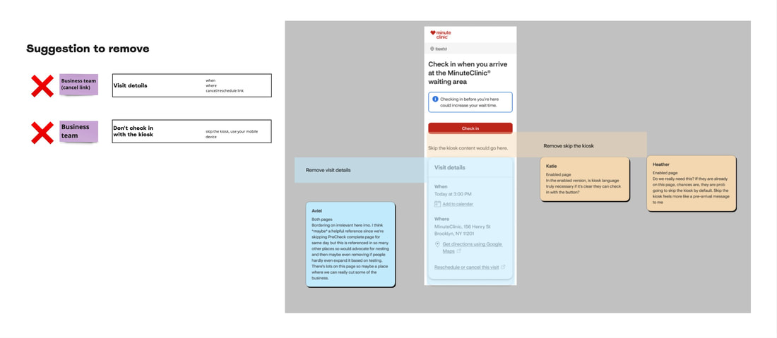
- Visit details (except the cancel/rescheduling link), because patients will already be at the clinic, we decided to remove the visit details section.
We decided to keep
- What happens if you check in before arrive in the waiting area (your wait time may increase), we kept this information in because it was an important request from the clinical team. Health care providers would come out to the waiting room and call the name of the checked in patient, only to find no one there. Then they'd move to the next patient in line. This caused friction if the patient had been at the store, just not in the waiting area.
- Cancel/rescheduling link from the visit details section, although we removed the visit details tile, pulled out the cancel/reschedule link to fulfill the business request of reducing wasted visits. Because the link was no longer in the tile, we didn't have to worry about the fact that that tile was owned by a different product team.
- The disabled button, this was a top priority for the product team to keep. Although this was a paint point for customers, they felt it would indicate to patients that it would become active when it was time to check in. The previous button content said 'check in when it's time'. We met in the middle and suggested dynamic content so that the button displayed the exact time patients could check in - 'check in at 3:20 pm'. We hoped that that would make the button clearer.

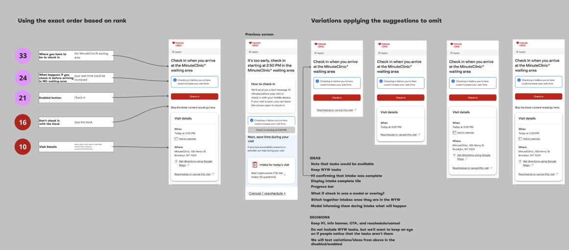
Mobile checkin (enabled)
We decided to omit the following:
We decided to omit the following:
- Visit details (except the cancel/rescheduling link), because patients will already be at the clinic, we decided to remove the visit details section.
- Skip the kiosk, because we removed the kiosk language from the checkin (disabled) and more importantly, because this was the part of the patient's experience where they were confused if they needed to use the kiosk, we kept the kiosk language in.
|
After deciding what to keep and what to omit, the priority order would ideally give us the everything we needed (in terms of where to place what). However, there were a few requests out of place that we needed to account for. The product team wanted the checkin (disabled) button to be aligned with the checkin (enabled). Although this was not a priority, and many people wanted to omit it, we moved it up to fulfill this request. It didn't feel too obtrusive. In fact, it created more unison between the two variations.
|
To ensure the new design and priority order was comprehensive, and considering the high stakes of these crucial screens, I conducted usability tests using usertesting.com with support from a member of the research team. We tested the comprehension of check in information and the new intake form. The results went swimmingly.
OUTCOME
Setting up expectations when it is too early to check in
Delivered high fidelity wireframes for MinuteClinic, check in (disabled) page variation
Delivered high fidelity wireframes for MinuteClinic, check in (disabled) page variation
|

|
Setting up expectations when it is time to check in
Delivered high fidelity wireframes for MinuteClinic check in (enabled) page variation
Delivered high fidelity wireframes for MinuteClinic check in (enabled) page variation
|

|