Creating inclusivity in the patient intake process
Delivered hi-fidelity screens | 2023
Patients need a way to trust that they'll feel safe being themselves when going to the doctor. Our main goal was to create a form that established that trust by allowing patients to communicate how they wanted to be addressed prior to a visit as well as select any concerns they had. This approach ensured that when patients met with their health care providers, the providers were equipped with the information needed to address them and any other concerns appropriately.
OUR AUDIENCE
Each person is unique with different experiences navigating and participating in the healthcare system. While our audience included all patients, our primary focus was patients who didn't perceive the healthcare system as a safe space where they could freely be themselves.
Their concerns and reasons varied, but they all shared the common feeling of distrust in the healthcare system.
Their concerns and reasons varied, but they all shared the common feeling of distrust in the healthcare system.
ROLES & RESPONSIBILITIES
Collaborate with other disciplines
I collaborated with multiple disciplines throughout the design process to create a more inclusive user experience including:
I collaborated with multiple disciplines throughout the design process to create a more inclusive user experience including:
- content strategy
- gender inclusivity design
- analytics
Make strategic decisions
Aside from collaborating, one of my main roles was to make strategic design decisions. Some of these decisions included which specific questions would go into the form to make the experience feel safe and where would form go in the flow.
Aside from collaborating, one of my main roles was to make strategic design decisions. Some of these decisions included which specific questions would go into the form to make the experience feel safe and where would form go in the flow.
Design high fidelity screens
Once the strategy was defined, I created high fidelity screens. We went straight into high fidelity due to our short time frame. We had one week to deliver the designs. Additionally, I had previously worked on all the experiences that the form would potentially go into. This allowed me to be resourceful and utilize existing form inputs and components. Finally, the feature was expected to be in high fidelity so that stakeholders could picture it in the production experience.
Once the strategy was defined, I created high fidelity screens. We went straight into high fidelity due to our short time frame. We had one week to deliver the designs. Additionally, I had previously worked on all the experiences that the form would potentially go into. This allowed me to be resourceful and utilize existing form inputs and components. Finally, the feature was expected to be in high fidelity so that stakeholders could picture it in the production experience.
Present designs
After just one week, my team and I presented this experience to stakeholders, product leaders, engineering leaders, and multiple design teams.
After just one week, my team and I presented this experience to stakeholders, product leaders, engineering leaders, and multiple design teams.
SCOPE & CONSTRAINTS
This feature was called a discovery enabler, meaning it wouldn't go to development after design was complete. The focus was all about innovation and pushing the boundaries for a more user-centered experience. Even though it didn't go right to developers, we kept engineers in mind so that when the time came, it would be easy to implement.
In scope
- Deliver high fidelity designs in one week
- Make the design as easy as possible to develop later on
- Determine where the design lived in the flow
- Seamlessly add into the flow
Out of scope
- Open-ended text areas that were more than one line
- Making large changes to any existing flows
PROCESS
To kick off our work, the content strategist and I worked closely with our gender inclusive designer to determine which areas of safety would be best to expand on.
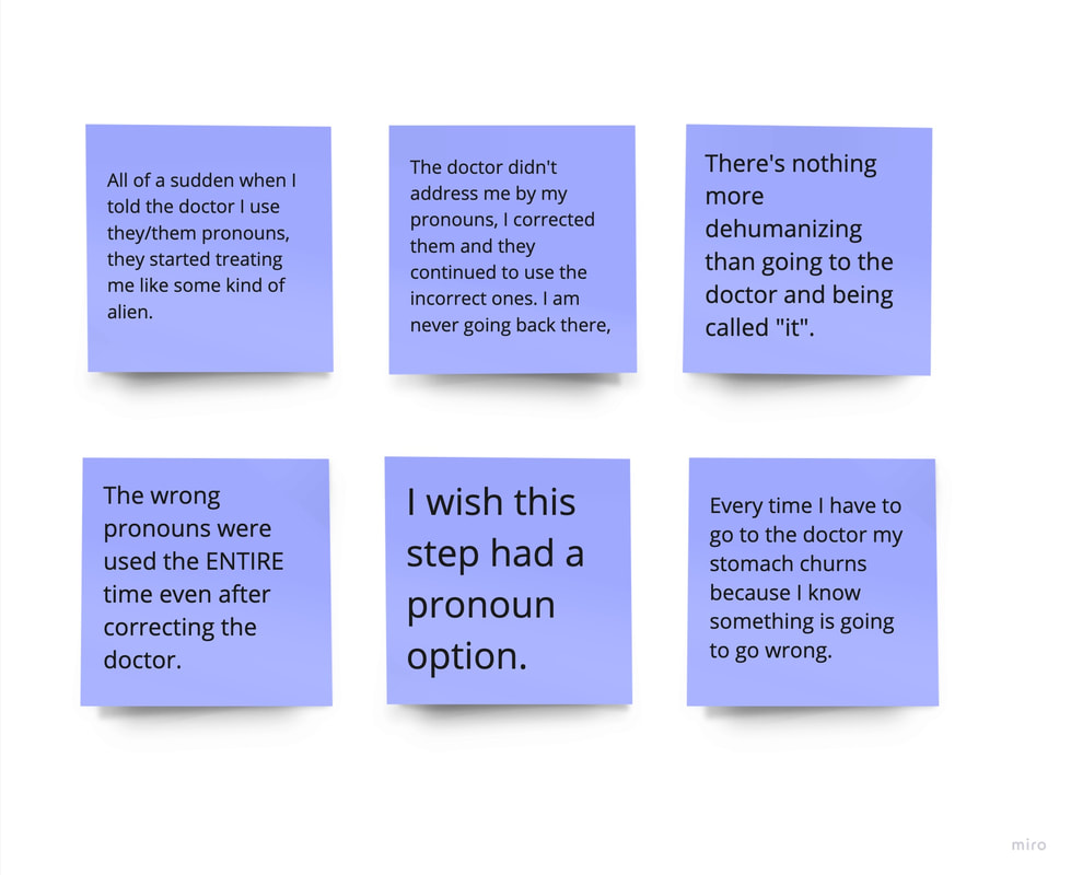
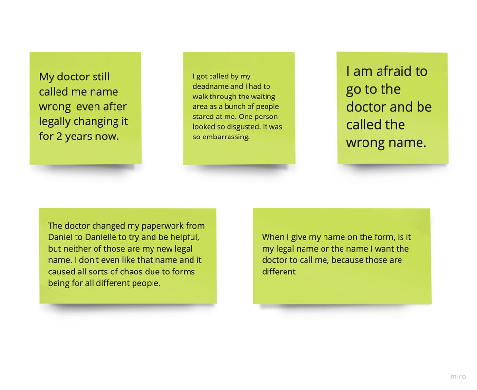
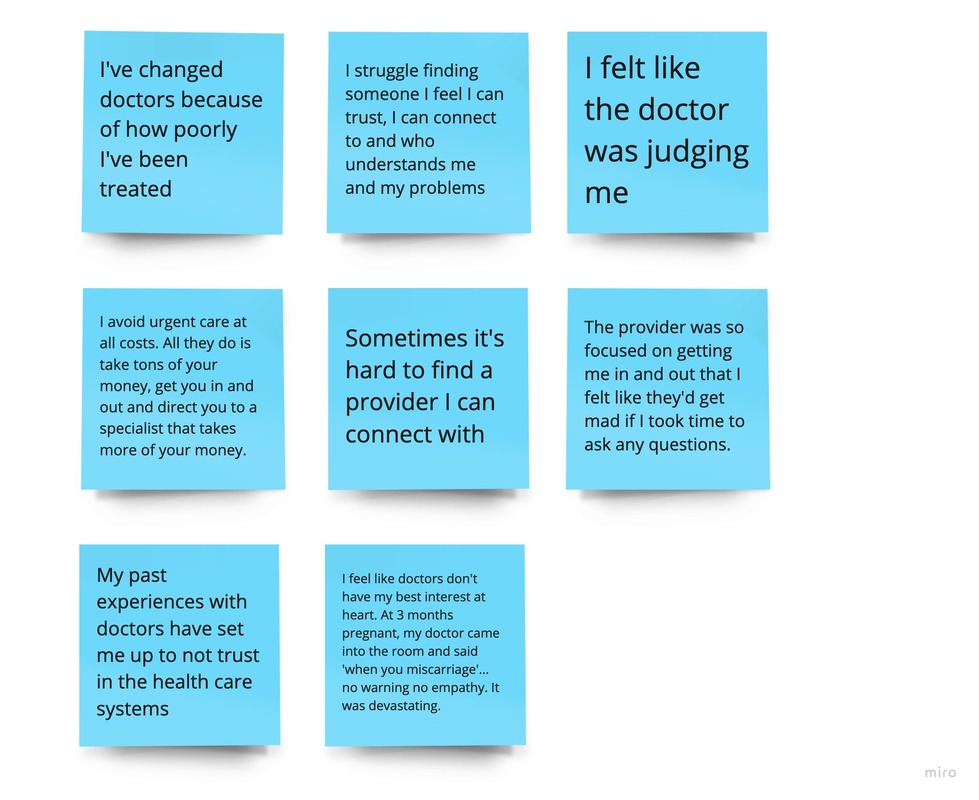
Our analyst pulled insights from Medallia, a qualitative analytics platform. These insights were real frustrations from real customers about their experiences with health care providers and members of the staff. We used this information to help determine the key pain points to solve for.
Our analyst pulled insights from Medallia, a qualitative analytics platform. These insights were real frustrations from real customers about their experiences with health care providers and members of the staff. We used this information to help determine the key pain points to solve for.
Based on our findings, we decided to focus on three main areas to foster inclusivity and to build trust.
|
Pain point 1: Pronouns
Giving the patients the freedom to choose how they want to be addressed by selecting their preferred pronouns on a form was one of our biggest recommendations. Recognizing and respecting an individual's preferred pronouns was a fundamental aspect that affirmed their identity and created a safe space. By allowing patients to communicate their pronouns, health care providers could avoid making assumptions about gender and avoid inadvertently causing discomfort or distrust. The goal of providing this information was to promote a culture of acceptance, enhance communication, and establish trust between patients and providers, ultimately leading to more compassionate healthcare experience. |
|
Pain point 2: First name
People's names are not merely labels; they are integral to their sense of identity and self-expression. Allowing patients to share their preferred first name acknowledged their individuality, while also acknowledging that their chosen name might differ from legal documentation due to personal, gender-related, or other reasons. By addressing patients with their chosen first names, health care providers could demonstrate a commitment to honoring patients' identities and create a safe space where they feel seen and validated. |
|
Pain point 3: General negative experiences
Enabling patients to indicate their concerns prior to a visit could enhance their trust in health care providers and the system. This proactive approach valued the patient's perspective and input. Giving patients the opportunity to voice their concerns beforehand allowed providers to attend to a patients individual needs and prioritize personalized care. This approach also streamlined the consultation process, allowing providers to be better prepared and more knowledgeable about the patients. As a result, patients feel heard, respected, and confident in their provider's ability to understand who they are. Having transparency and collaboration established trust and created a better patient-provider relationship. |
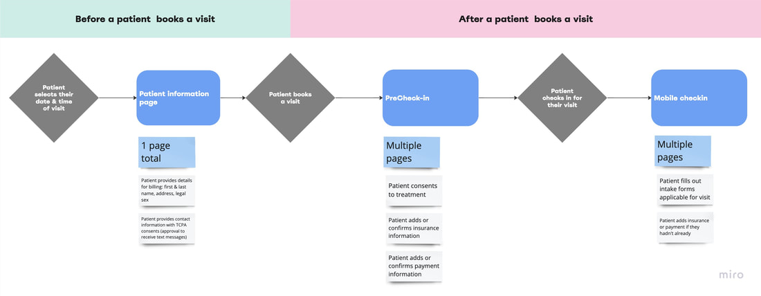
When determining where this page would live in the flow, there were three areas we considered. We knew that it had to exist in a place where the patient is completing forms for their visit. We also knew that this form could be optional, allowing the user to skip the form if they wanted to, yet make it available to those who would benefit from it. In the current experience, there were three places forms got filled out. Together we looked at the pros and cons for each one.
Option 1: Patient information page
The patient information page was a one page form a patient filled out before they booked their visit.
Pros
The patient information page was a one page form a patient filled out before they booked their visit.
Pros
- A patient could experience a sense of trust prior to booking, which may lead them to feeling more confident that they're going to a place where they feel safe.
- Patients have to add their legal name and legal sex to this page, so it may be fitting to also add how they want to be addressed.
- We likely would be a able to add a component onto this page, whereas the other flows would need a new page for solely the form.
- A patient is required to fill out this form every time they book a visit. It can auto-populate one's information to make it easier. Because the patient will see the form each time, they will be reminded that this is a safe place.
- Having the form in this location would allow us to address patients by their preferred first name in emails and text messages in future iterations (post-MVP).
- I met with a member of the gender inclusivity team and they highlighted that people in some communities may be put off that we are addressing this gender-affirming care (pronouns and name), and it could deter these people away from booking.
- This would me one more thing a patient would have to do before booking, which means it would take more time to book and people may drop off.
Option 2: PreCheck-in flow
The PreCheck-in flow came after a patient booked a visit. In this flow, the patient filled out a variety of forms including: consents to treatment, optional consents to receive marketing, consents based on location, adding insurance information, and adding payment details. Different states and services had additional consents. Most patients filled out these forms directly after they booked a visit.
Pros
- This flow offers a vast variety of forms and inputs. Because of the multiple forms, having it here may offer a seamless feeling. They'd complete one form and onto the next.
- Having an addition other form may not feel too obtrusive.
- Without having the awareness of this form upfront, the patient may not feel that this is a safe place to go prior to booking the visit.
- Each page had a different purpose. Therefore, we would have to make this new form on it's own page, which adds to the amount of clicks and pages a patient needs to fill out.
- The PreCheck-in experience has a robust progress bar. Each percentage is static and set in stone all the way to 100. We would have to figure out a way to break the usual percentage pattern.
Option 3: Mobile checkin flow
The mobile flow came directly after a patient booked a visit. In this flow, the patient filled out intake forms applicable to their visit. If patients hadn't added in their insurance or payment in the PreCheck-in, this part of the flow prompted them to add it again.
Pros
The mobile flow came directly after a patient booked a visit. In this flow, the patient filled out intake forms applicable to their visit. If patients hadn't added in their insurance or payment in the PreCheck-in, this part of the flow prompted them to add it again.
Pros
- Given that this flow was leading right up to a visit, this could put the patient at ease.
- The intake forms in mobile checkin related to the here and now. They were forms specifically for the scheduled visit. Adding in a form sharing how a patient wanted to be addressed may be associated with the here and now as well. Ie. right now, I want you to call me xyz.
- Without having the awareness of this form upfront, the patient may not feel that this is a safe place to go prior to booking the visit.
- Each form had a different purpose. Therefore, we would have to make this new form on it's own page, which adds to the amount of clicks and pages a patient needs to fill out.
Decision time
Ultimately, we chose Option 1: the patient information page.
Ultimately, we chose Option 1: the patient information page.
- We felt it was more valuable to foster that safety from the jump, prior to booking a visit.
- Given that a patient had to add their legal name and sex on this page, it made sense to affirm that the providers would address them by a preferred pronouns and first name right after. Something that might feel triggering, was instantly resolved.
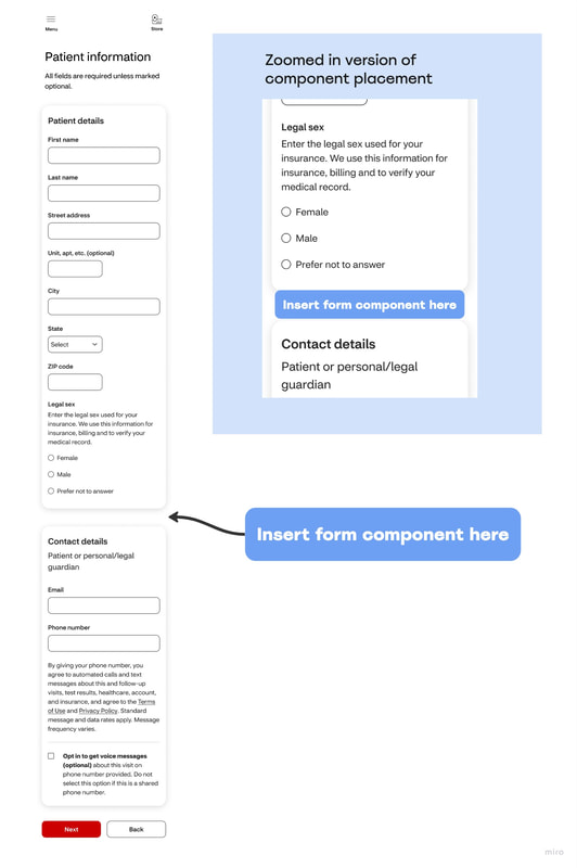
- We also liked the idea of not adding additional pages to the patient's experience. On the patient information page, we could add a form component right onto the existing page.
- Having an optional form component seemed like a better experience than an optional page. Patients could skip the form component if they wanted to, yet make it available to those who would benefit from it.
Now that we decided on the where this optional form component would go in the flow, it was time to make the form.
|
Determine where the component will go on the page
|
|
Change some existing content
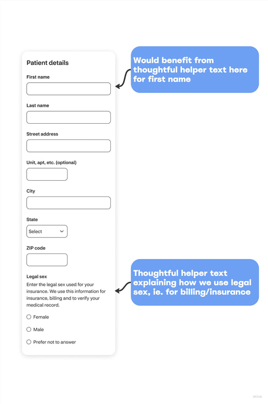
When looking through the existing patient details, I noticed an area of improvement. For legal sex, there was thoughtful helper text that let the patients know how we use that information (ie. for billing and insurance). However, there wasn't this thoughtful helper text for the patients legal first name. Instead, it just said, 'First name'. While changing the existing flow or adding any additional lines of content was not in scope, changing existing content was. I met with the content strategist who gave a few suggestions. For MVP, we changed the content to say Legal first name and Legal last name. For Post-MVP, she suggested one of the following options:
We ended up going with the MVP option, as it was in scope. During out presentation, we mentioned the Post-MVP options as future considerations. |
Create the component
The time had come to start building the component. I utilized my resources for efficiency and precision. I had the most up-to-date high fidelity patient information page in Figma from a past feature I worked on a few months prior. I utilized the tile, the H2, body copy under h2, and input textfields of the existing 'Patient details' and 'Contact details' tiles to build the new component. I relied on intake forms I worked on in the past as well as the UI kit for anything not on the current Patient information page.
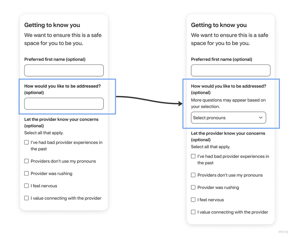
Once I had the shell built, the content strategist and gender inclusivity designer helped me refine the content and structure. The content strategist wrote the H2 and body copy under the H2. The gender inclusive designer suggested that I change the question 'How would you like to be addressed' from being a text input to being a select drop down. They provided this feedback for a variety of reasons and we bounced ideas off one another.
- People that were not in support of pronouns could use that time to write something negative. Those comments would then be shown in the provider's database. This could make the provider feel uncomfortable and unsure of how to address that patient.
- The gender inclusivity team member provided a set list of pronouns that people may go by, making it easier for patients to quickly select an option.
- By adding a select, the selection text said 'select pronouns'. This fit to some thoughts I had because I wondered if a patient would know that 'how would you like to be addressed' meant to add pronouns. This solution made it easier for patients to understand what to select.
Pronouns are deeply personal and can vary from person to person. Some individuals may prefer pronouns that were not a choice of the selection options, and new pronouns continually get introduced as language evolves to be more inclusive.
To account for this, we still included a text input, but it was more discreet versus being the only way to add pronouns.Only when a patient selected 'my pronouns are not listed' did this additional input appear. I designed an progressive disclosure text input to account for this experience. I used intake form components I had previously worked on to create this.
The last section of the component was solving for patients with more general trust issues.The team talked about whether or not to use a text field area or a multi-select. Having worked on the patient information page in the past, as well as intake forms, I knew that text areas were a strict no-no for prior to visit forms. They were a liability because if someone wrote in the forms, I am having a lot of trouble breathing, and then something happened to them, we would be liable. When I pitched the idea of a multi-select, our analyst confirmed that we could track that information and use it to continue to improve patient experiences in the future. We decided to go ahead with multi-select checkboxes. Together the content strategist, gender inclusivity designer, and analyst reflected on the research and came up with five options. I also branched out and posted on the companies #watercooler in Slack to help us determine the options we went with.
After just one week, my team and I presented this experience to stakeholders, product leaders, engineering leaders, and multiple design teams. One of the stakeholder asked us how we would track the results. For example, what if more people select 'my pronouns are not listed' than those that select from the available options? And how do we know if this is making a positive impact?
Having trained experience with various analytics platforms, I responded with numerous ways to track and measure success.
Having trained experience with various analytics platforms, I responded with numerous ways to track and measure success.
- Track qualitative data from Medallia. This is direct line to patients. Patients can click a button at any point in their experience to provide open ended feedback. Medallia also has a robust filtering system, so we could filter by keywords or even by certain pages to consolidate the feedback we needed.
- Track quantitative data from AdobeAnalytics and Quantum Metric. We could track click rates, how much time it took a patient to answer a question, how many people skipped this section, what answers get selected the most frequently, what the returning patients select, and more.
- We could also have the gender inclusivity team monitor the evolution of language and inform up of anything we may need to update.
OUTCOME
Design of the year 🏆
Working on this feature was humbling. Making a positive impact in people's lives is why I do what I do. After we presented this feature, we found out that our feature was chosen as the design of the year for innovation and inclusivity. It was an honor to represent unheard voices and create a safe space for so many people. It is set to be implemented in 2024.
FUTURE CONSIDERATIONS
|
Rethink existing content
Because the 'Patient details' section did not include helper text for legal first name, we recommend thinking through this experience to help users know why we need their legal name. |
Onboard provider
Onboard the provider with this new form so they are prepared to take action and meet patients where they are at. |
|
Consider provider
Feeling safe does not need to only apply to patients. It could also apply to providers. We could also consider a way for the providers to share their chosen first name and their preferred way of being addressed. |
Analyze and adjust
As language evolves, have the gender inclusivity team monitor language and adjust the pronoun selection options as needed. Additionally, we could dig into the general concerns checkboxes a bit more to and determine patterns. |
|
Beyond patient-provider relationship
Utilize this information outside of the patient-provider relationship. Address patients by their preferred first name in emails, text messages, and beyond. |
Analyze the impact
Utilize this information outside of the patient-provider relationship. Address patients by their preferred first name in emails, text messages, and beyond. |
Additional research for the general trust checkboxes
For the question, 'Let a provider know any concerns', While I did feel confident about the checkbox options, I feel like this merits more research and discovery. I don't necessarily thing there was enough insights to say with 100% certainty that these are the options to go with. Further digging may help increase that certainty and create a better experience.
For the question, 'Let a provider know any concerns', While I did feel confident about the checkbox options, I feel like this merits more research and discovery. I don't necessarily thing there was enough insights to say with 100% certainty that these are the options to go with. Further digging may help increase that certainty and create a better experience.


