|
Smart home technology allows people control of their home's temperature, lights, entertainment, and appliances. My team ran with this idea and designed an all inclusive mock smart home app. This allowed users all access to their smart home ecosystem on one platform. We developed an innovative approach to shift the smart home technology paradigm. Over the course of six weeks, three one-week UX sprints and three one-week UI sprints, my hard working team produced Homee.
|
A SMARTER HOME AND LIFESTYLE
|
Our research began with a provided smart home vision pdf. This allowed us to understand what smart home devices consisted of. To connect with potential users, we conducted interviews. Some questions were geared towards the current role of these types of devices, smart or not. We asked people to define what their everyday home environment was like. Also, we sought views on smart home technology and how it has or would impact their lives.
Using an affinity board, we quickly determined patterns. We divided and synthesized our interview findings into categories. |
Work schedule
The majority interviewed worked full time and were frequently gone for more than six hours a day.
Home environment
We interviewed homeowners, renters, landlords, people in houses, apartments, and townhouses. Most people had roommates or lived with family.
home security
The interviewees valued home security. Security represented feeling safe, emergency notifications, and personal privacy.
General technology
The interviewees were all smartphone owners. People bought iPhones because of its ease in use. The most common device used daily was mobile, followed by laptop. People bought Android for its customizations. All of the people we interviewed used multiple technology platforms in addition to their phones and computers.
smart home technology
People liked the idea of smart home technology because it brought convenience and control. It needed to be affordable. Their ideal smart devices were lights, locks, and temperature.
home values
Interviewees wanted more control over their home. Quality of a product was better than quantity. Convenience and saving money were both important. Relaxing after a long day of work was vital.
Home Frustrations
People were frustrated when roommates and/or family members forgot to turn off the lights and lock the doors. Also, people felt frustrated from high bills.
A DAY IN THE LIFE OF THE USER
We created two personas based on the research we gathered. These personas were used as tools throughout our teams design process. They helped guide us to define and identify the main problem that we worked to solve. This ensured that our app fulfilled the needs of our users. Dan, our primary persona, wanted a way to quickly control his home operations. As a working father, Dan needed to check the app while he was away from his home. Our secondary persona, Amy, had similar values. She fell into a younger demographic and was a single renter with roommates.
|
Dan
The Alpha Family Man
Married | Father | Homeowner | Age 45
|
Dan's goals and motivations were to
Dan was frustrated by
|
CREATING A CONVENIENT TOMORROW
People experience the challenge of needing to be in two places at one time, home and the work place. An ideal home environment is one that is safe and secure. People strive to live with convenience and have control of their homes. We focused on an interface that solved these problems.
The working professional needs a convenient way to remotely operate multiple home technologies because it is challenging to monitor their home environment when most of their time is spent at work. |
With Dan and Amy in mind, we created four main design principles. These principles represented the fundamental characteristics that guided our design decisions. They also helped ensure we solved our users main problem.
1. SecureThis app was trustworthy and secure. People felt in control of their home, They could easily track their home operations from any location.
2. Meant for YouEach user had a unique lifestyle and home environment. The interface used a flexible layout. Each room, category, and device was customizable.
3. SeamlessThe user seamlessly operated different smart home technologies from one app.
4. Clean and ClearThe text was clean and legible. The icons were clearly defined. The hierarchy of information was straightforward. This allowed users to navigate through the app with ease.
|
DESIGNING SMART
EARLY ON, LOW-FIDELITY PROTOTYPES
Our team organized a sea of ideas using round robin and card sorting. The we individually created distinct paper prototypes and uploaded them into POP. We only tested three of the four prototypes. One teammate had a straightforward approach. Another had a visually stimulating and personal prototype. I focused on a simplistic clean design and one was a combination of the three. Ultimately, through some discussions and debates, we decided on the three diverse prototypes. They offered a broader spectrum of possible results.
Testing the concepts
|
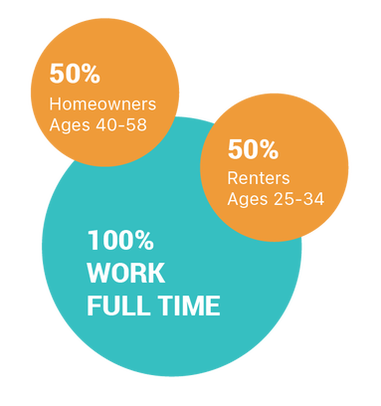
Testing the prototypes helped us determine which concepts made sense to the user. Through this process, we discovered the hierarchy of navigation users responded well to. We tested 6 people total. 100% of the testers worked full time, 50% were home owners, and 50% were renters. This gave us a larger pool of insights. We gave users a specific scenario that directly related to our research. On average, people spent the majority of their day at work or away from their home.
SCENARIO: They were away from their home. They would like to check in on certain parts of their home remotely.
To supplement out user research, we conducted a survey. 70% of those surveyed commonly forgot to turn off applianced. Therefore, we presented testers with a correlating task.
TASK: Check to see if a light was on at their home.
|
|
3 prototypes had an option to access the lights through the rooms.
|
2 prototypes had a "quick lights" option with access to lights from the main screen.
|
1 prototypes included access of lights through an appliance section
|
|
All testers successfully navigated and completed their tasks.
Another finding pertained to inclusive design.
Visual elements and textual elements were equally important. Some prototypes included this option. One test was color blind and without a textual element pairing with an icon, they have had trouble completing the task.
|
A SMART FLOW
NEXT STEPS, MID-FIDELITY PROTOTYPES
App Maps
Prior to crafting the mid-fidelity prototypes, we each diverged and created distinct app maps. These allowed us to revise any mishaps from our last round of testing.
My app map
Prior to crafting the mid-fidelity prototypes, we each diverged and created distinct app maps. These allowed us to revise any mishaps from our last round of testing.
My app map
Testing the concepts
We moved onto the mid-fidelity Axure prototypes. In order for users to use this app, they needed to connect their smart home devices to the app. Because of this, I wanted to test the process of adding a device. I referred back to the smart home vision pdf to understand how to integrate smart home technology. The master home connector hub was the platform. It used bluetooth to initially add devices.
We tested adding a device through the rooms, the settings, and through on-boarding. From there, we determined which process was comprehensive. For further refinement, we also tested checking the lights.
Adding a device
Similarity to our last results, the mental model of the usr was to add a device through the rooms. The way we set up this process lacked specificity. Users needed to feel confident that their device was added. It was important to notify the user once a device was added onto the app. For transparent communication, the add a device icon needed to be strategically places on the screens.
|
|
|
On-boarding
The on-boarding results were conclusive. Users skipped this process. In order for the on-boarding to work, we needed a new approach that engaged users.
|
|
|
Checking the lights
Users equally valued having both the quick lights option and access to lights through the rooms. One teammate suggested adding a temperature quick option. In our research we found people valued quickly controlling the temperature as well. Moving forward, we applied both options onto the home page.
|
|
UNIFIED FLOW
NEXT STEPS, MID-FIDELITY PROTOTYPES
Over an open discussed, we exchanged ideas and pulled beneficial aspects of our prototype test findings thus far. We collaborated on one unified navigational flow. This process was extremely easy.
|
The navigation
We opted for my user flow because each tester efficiently accomplished their tasks without any mistakes. This flow was clear and comprehensive.
|
The main screen
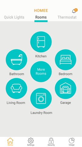
My teammate's radial home screen was easy to use and engaged the audience. It aligned with our design principle "meant for you" because it had potential to be customizable.
|
The bottom tab bar
Using interview insights, my team joined forces and created a bottom tab bar.
|
Home
Users found sense in accessing smart home features via their rooms. Home was the way users would access these rooms and control their living space.
|
Settings
Settings allowed used to customize their profiles, check in on notifications, and sign out.
|
Security
Security was important because users valued family and pet safety and home protection.
|
Utilities
Users valued saving money on basic utilities. Here, users could quickly check in on there bills and budget accordingly.
|
FEELING SMART
ADDING THE FACE, HIGH-FIDELITY PROTOTYPES
Using our unified flow, we each created a distinct high-fidelity prototype. To begin this process, we each made mood boards and style tiles. That followed with individual critiques and refinement. Each prototype had a unique look and feel. They were thoughtfully executed with Dan and our design principles in mind.
We exported our screens into InVision. I utilized hot spot templates and screen overlays. I incorporated customizations that catered to the user's personal needs. Some customizations included: adding rooms, removing categories within a room, naming devices, and customizing the six home screen rooms on the radial menu.
THE FINAL FLOW
Final testing
There were three intentions for this round of testing
|
Clarification on on-boarding
A more engaging on-boarding yielded the same results. Users either skipped it, did not retain the information, or experienced confusion. Ultimately, we exempt on-boarding from future considerations. should the user have questions moving forward, here was a help section in the settings. It was vital to create an app that was visually so simple that one doesn't need instructions at all.
|
User response to pop-ups
Users responded well to the additional screen overlay pop-ups that I created. The concept was clearly understood. Users accomplished the prompted task with little to no errors. Thus, we added those into our final flow.
|
Favored interface style
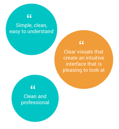
Users understood the UI elements including the buttons and icons. All of the fonts were clear and readable. In terms of color, all the prototypes were equally favored.
|
|
All testers successfully navigated and completed their tasks.
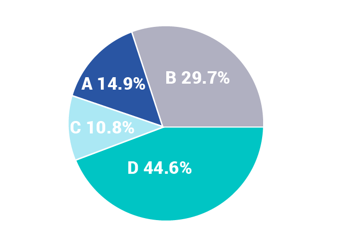
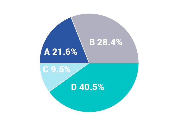
Moving forward, we conducted a survey that 75 people filled out. this gave us a larger scope of people to work with. 48% fit into our primary persona category and 52% fit into out secondary. The questions pertained to smart home technology and included screenshots of each of our different prototypes.
|
THERE'S NO PLACE LIKE HOME
|
The final unified high-fidelity interactive prototype incorporated my navigation paired with my teammates overall UI look and feel. One teammate created a style guide to refer to as we flushed out all of the final screens. In conclusion, we provided a way to solve the problem for our users. Users could seamlessly operate multiple home technologies on one platform. They could monitor their home environment while at home or at work. The app had a visually clean and clear design that was customizable to fit the intended user.
InVision prototype link |
|
Photos from emily @ go haus go, DesignFolly.com

