Giving patients an easy way to add complex allergies
Delivered lo-fidelity wireframes | 2023
Patients needed a way to easily add their allergy information before their visit so they could maximize the time they spent with a provider during their visit and eliminate time spent filling out administrative tasks.
OUR AUDIENCE
1. Patients with allergies
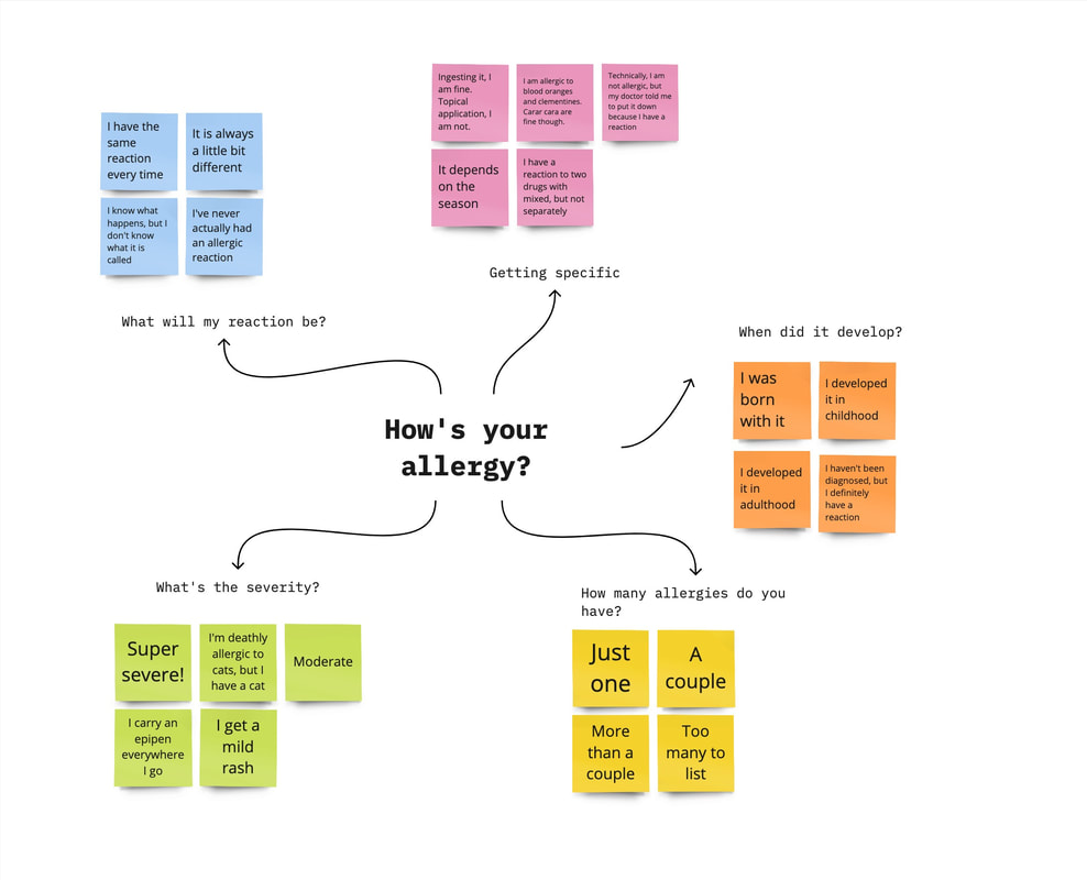
Our primary audience were patients with allergies. To kick off the project, the content strategist and I brainstormed various experiences people may have with their individual allergies. We quickly learned that allergies are complex. This brainstorm session helped us keep these complexities in mind and design an experience that encompassed all these unique patients.
Our primary audience were patients with allergies. To kick off the project, the content strategist and I brainstormed various experiences people may have with their individual allergies. We quickly learned that allergies are complex. This brainstorm session helped us keep these complexities in mind and design an experience that encompassed all these unique patients.
2. Patients without allergies
Our secondary audience segment included patients without allergies. Our goal was to allow these patients to quickly and seamlessly bypass the adding allergy form all together.
Our secondary audience segment included patients without allergies. Our goal was to allow these patients to quickly and seamlessly bypass the adding allergy form all together.
ROLES & RESPONSIBILITIES
As part of my role as design lead, I collaborated extensively with people across a number of teams. I collaborated with the following teams and people throughout the design process.
Connected with our UX research team
Right before this project began, the UX research team launched an in depth study to learn about the mental models of patients filling out intake forms. We connected with this team at the start of the project to ensure our design matched what patients want and expect. We incorporated insights we learned into our research synthesis.
Right before this project began, the UX research team launched an in depth study to learn about the mental models of patients filling out intake forms. We connected with this team at the start of the project to ensure our design matched what patients want and expect. We incorporated insights we learned into our research synthesis.
Aligned with the product team
Being an embedded designer on a scrum team, I worked closely with the product team for each step of the process.
Being an embedded designer on a scrum team, I worked closely with the product team for each step of the process.
- I learned about the product requirements and together we defined the scope.
- I asked questions along the way to ensure all use cases were accounted for.
- Together we met with the clinical and legal teams to clarify constraints.
- I presented brainstorming and research to make sure concept aligned with products vision.
- I communicated throughout the evolution of the wireframes to ensure deliverables were met.
Learned from the clinical team
Meeting with the clinicians helped us understand how health care providers used the allergy information now.
Meeting with the clinicians helped us understand how health care providers used the allergy information now.
- The health care providers would verbally ask a patient if they had any allergies. If yes, they asked what the allergy and associated reactions were.
- There was a standard set of 17 types of allergic reactions.
- Each allergic reaction was linked to a severity that health care providers saw.
- If a patient has an allergy, the health care providers can put it into the database.
- If a patient has an allergic reaction that is not in the database, the health care providers can add it in a text area.
Gained key information from the legal team
Although the health care providers could enter allergic reactions in as a text area, we learned from the legal team that we could not have any text areas in our allergy form. When patients were in a clinic and gave a provider their allergy information, the patient was liable to share the correct information. When patients filled out a form prior to the visit, we were liable. In the event that someone had a serious health issue, whether it be an allergy or not, if the patient entered that information into a text area and something happened to them, we would be responsible. For example, let's say Taylor scheduled a visit for a sore throat. They entered in the text area that they could barely breathe. If something happened to Taylor before their visit, we'd be responsible.
Although the health care providers could enter allergic reactions in as a text area, we learned from the legal team that we could not have any text areas in our allergy form. When patients were in a clinic and gave a provider their allergy information, the patient was liable to share the correct information. When patients filled out a form prior to the visit, we were liable. In the event that someone had a serious health issue, whether it be an allergy or not, if the patient entered that information into a text area and something happened to them, we would be responsible. For example, let's say Taylor scheduled a visit for a sore throat. They entered in the text area that they could barely breathe. If something happened to Taylor before their visit, we'd be responsible.
Understood the mapping from the technical teams
We connected with the architect and lead engineer to understand what happens when a patient adds their allergy information prior to their visit.
We connected with the architect and lead engineer to understand what happens when a patient adds their allergy information prior to their visit.
- Patients could add as many allergies as they needed to -- no number limit.
- Patients could not add allergies or allergic reactions that were not in the database via a text area.
- Allergic reaction content could not be adjusted (ie. photosensitivity could not be changed to say, skin reaction to light).
- Allergic reactions could not be grouped as one selection (ie. rash and hives)
- Once a patient added an allergy and reaction, they could edit or delete it prior to submitting the form.
- Once a patient submitted their allergies form, they could no longer edit or delete their submission.
- Returning users, or patients that already entered in allergies at their previous visit could have their allergies auto-populated.
- In a post-MVP iteration, patients could access, edit, add, delete their entered allergies through a health dashboard application
Work side-by-side the content strategist
I worked closely with the content strategist throughout the whole design process. Together we created lo-fidelity wireframes.
I worked closely with the content strategist throughout the whole design process. Together we created lo-fidelity wireframes.
SCOPE & CONSTRAINTS
In scope
- Know that this form would end up going into a flow after booking a visit and prior to the visit.
- Allow patients with no allergies to bypass allergy intake form
- Allow patients with allergies to search for allergies within our database and give them a way to choose from a provided set of allergic reactions
- Allow patients to choose one or more allergic reactions
- Each allergy has the exact same allergic reaction options to choose from
- Allow patients to add multiple allergies (no limit to the amount)
- Allow patients to add, edit, and delete allergies prior to submission
- Provide patients a way to add allergies or allergic reaction that were not in the database.
Out of scope & constraints
- Determine the exact place this would live in the flow
- Allow patients to edit their allergies after submission
- Save entered allergies into a health dashboard
- No text areas (ie. for adding allergies not in the database)
- Adjust allergic reaction content
- No ability to specify if an allergy is self-diagnosed vs medically provided
PROCESS
To understand how patients filled out an allergy form today, the content strategist and I conducted a competitive analysis. What did allergies forms currently look like? Were allergies categorized in certain ways? How much did someone share about their allergies? What were experiences like when an allergy was not in the database?
To replicate how our patient's would experience the form, we looked at allergy forms completed before a visit. Our company offered a variety of services, from vaccines, travel health, and physicals, to ear wax removal, yet each one required allergy documentation. No matter what the services were, most healthcare services required allergy forms prior to a visit. For this reason, we looked at allergy forms from a variety of different healthcare services.
To replicate how our patient's would experience the form, we looked at allergy forms completed before a visit. Our company offered a variety of services, from vaccines, travel health, and physicals, to ear wax removal, yet each one required allergy documentation. No matter what the services were, most healthcare services required allergy forms prior to a visit. For this reason, we looked at allergy forms from a variety of different healthcare services.
|
Some of these services included:
|
|
We also looked at allergy forms that could be filled out at any point in time. The intention of these forms was to provide a way to report one's own allergies for personal records. While these didn't match when our patients would fill out the form, the patients were still adding allergies and reactions. We found that these also had more robust digital capabilities whereas forms prior to visits tended to be open-ended.
1. Allergies were not broken down by type of allergy on forms
Although the American College of Allergy, asthma, and Immunology defines over 19 different allergy types, most allergy forms did not break down allergies. The few that had categories showed "drug allergies" and "non-drug allergies."
Although the American College of Allergy, asthma, and Immunology defines over 19 different allergy types, most allergy forms did not break down allergies. The few that had categories showed "drug allergies" and "non-drug allergies."
Takeaway: It was helpful to know that in most cases, patients were not brought through an experience where they had to know or add allergies based on type of allergy. At the beginning of our research we wondered if it would be easier for people to choose allergies based on type (for example: a seasonal, or food, animal etc.). Eliminating this need created simplicity and reminded us that each allergy is complex and unique. For example, if someone was allergic to silicone, that could technically be a drug or non-drug related allergy. Having categories might create unneeded friction because patients may not know which category to use.
2. Forms were open ended
Most allergy forms were open ended, especially for allergic reactions. Digital forms provided additional text areas for patients to describe and give additional details. Additionally, because most forms were open ended, patients could easily add allergies that were not a the database.
Most allergy forms were open ended, especially for allergic reactions. Digital forms provided additional text areas for patients to describe and give additional details. Additionally, because most forms were open ended, patients could easily add allergies that were not a the database.
Takeaway: Because we were not able to add text areas, we had to take a step back, reflect and focus on the benefit of having a text area. One of the main benefit was to keep patients moving forward in a form without getting blocked by their complex allergies. Even though we couldn't add a text area, we could make sure that our design kept the patient moving forward, feeling assured, and not blocked.
3. Selecting medication names and allergic reactions were not user friendly
Medications were difficult to spell. When forms were not open ended, they relied on the patient's spelling to find the allergy in auto-suggest search bars. Additionally, forms that asked patients to choose from a list reactions often went beyond a 14th grade reading level.
Medications were difficult to spell. When forms were not open ended, they relied on the patient's spelling to find the allergy in auto-suggest search bars. Additionally, forms that asked patients to choose from a list reactions often went beyond a 14th grade reading level.
Takeaway: Although we weren't able change our allergic reaction content, this inspired us to find a way to make choosing a reaction as easy as possible. It also inspired us to give someone an out, if they did not know what to select.
4. Allergy and allergic reactions were often on the same page
Most forms, especially the forms filled out prior to visits, had patients enter allergies and reactions on the same page.
Most forms, especially the forms filled out prior to visits, had patients enter allergies and reactions on the same page.
Takeaway: Creating an experience that patients were already familiar with helped us in choosing how to structure our form.
5. Patients want to choose their own adventure
The mental model of patients filling out a form for a visit is that they want to choose their own adventure. They want to be able to do each step of the process at their own pace. They want options along the away to keep them moving in the direction of their choice.
The mental model of patients filling out a form for a visit is that they want to choose their own adventure. They want to be able to do each step of the process at their own pace. They want options along the away to keep them moving in the direction of their choice.
Takeaway: Allowing users to follow the path for themselves, while keeping them moving along aligns with what users want and expect.
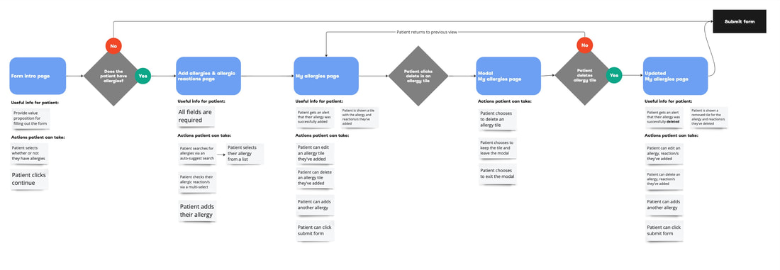
With all of the takeaways from research, I began looking at all the main use cases, page goals, and actions. This information brought user flows to life. I narrowed down the experience to one page for patients without allergies. For patients with allergies, they would see a total of three to four pages. These pages accounted for adding, editing, and deleting allergies/allergic reactions. I worked with the content strategist to determine what would go onto each page. Once flushed out, we confirmed these use cases, page breakdowns and user flows with the product team, engineers, and architects.
The happy path(s)
The happy path consists of two scenarios. We started with the happy paths and expanded from there. This made sure that when we dove into the complex use cases, we kept the foundation of the form simple. Thinking about the flow in terms of use cases allowed us to imagine we were the patient and cover the bases.
Use cases:
- patient does not have allergies
- patient has allergies and adds an allergy/reactions
Editing an allergy/reaction
The next flow accounted for users editing allergies.
Use cases:
The next flow accounted for users editing allergies.
Use cases:
- patient edits allergy/reactions
- patient starts editing allergy/reactions, then backs out
Deleting an allergy
The next flow account for patients that added an allergy, but then decided to delete it.
Use cases:
The next flow account for patients that added an allergy, but then decided to delete it.
Use cases:
- patient deletes an added allergy/reactions
- patient starts deleting allergy/reactions, then backs out
Once the flows were at a solid place, I dove into the wireframe components and the content began the content.
|
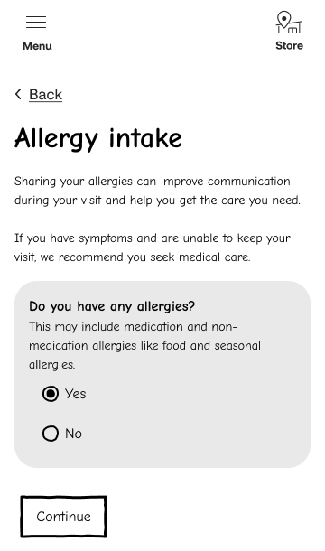
Form intro page
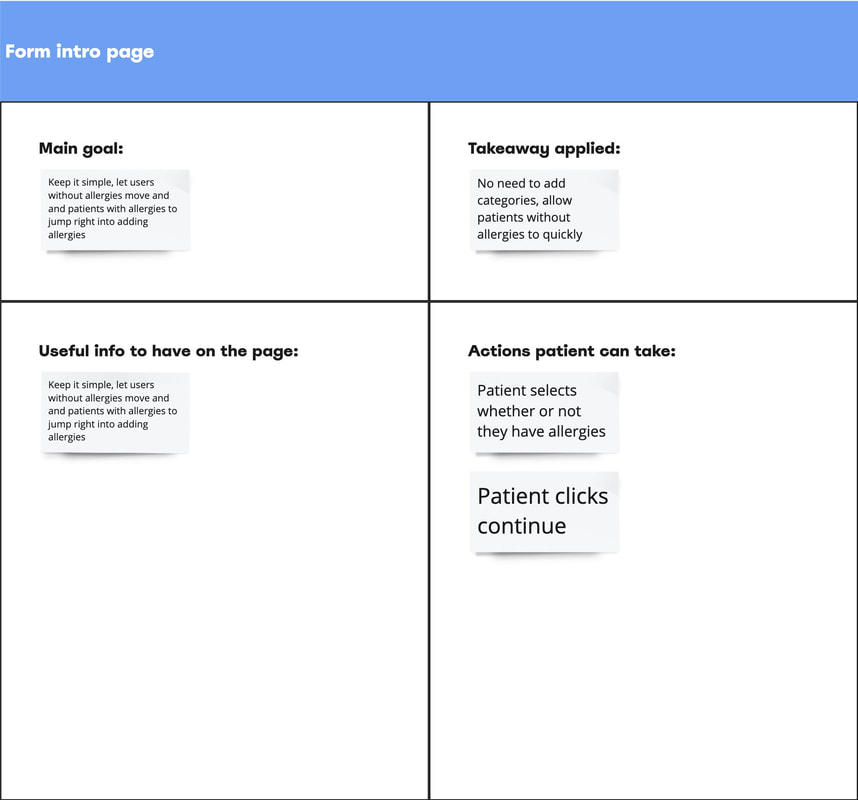
The goal of the intro page was simplicity. We wanted patients to spend as little time on this page as possible. Keeping it simple let users without allergies move on and patients with allergies to start adding them right away. To do this, the first page had a single yes or no question -- Do you have any allergies? The research suggested to refrain from adding types of allergies. As we added the content, we wondered if patients would associate a doctor's visit with medication allergies only. It was important to make sure that patients added both. For example, if someone was allergic to alcohol and was scheduled for a vaccine, the doctor would need to refrain from using an alcohol swab. To keep it easy, yet still be thorough, we added helper text that said the allergy may include medication and non-medication allergies. |
|
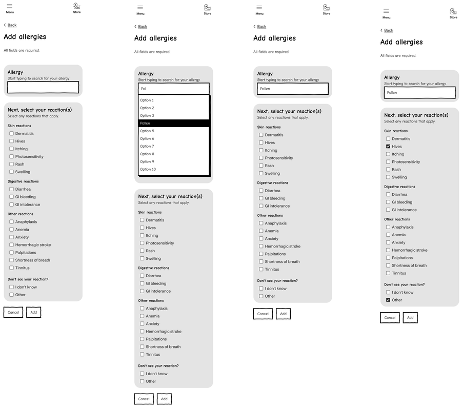
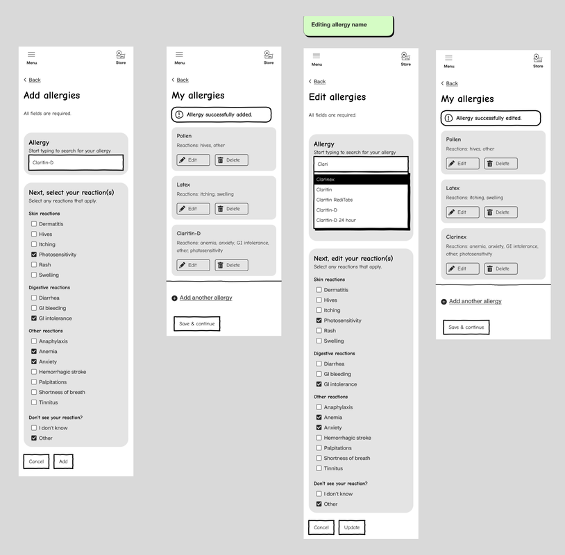
Add allergies page
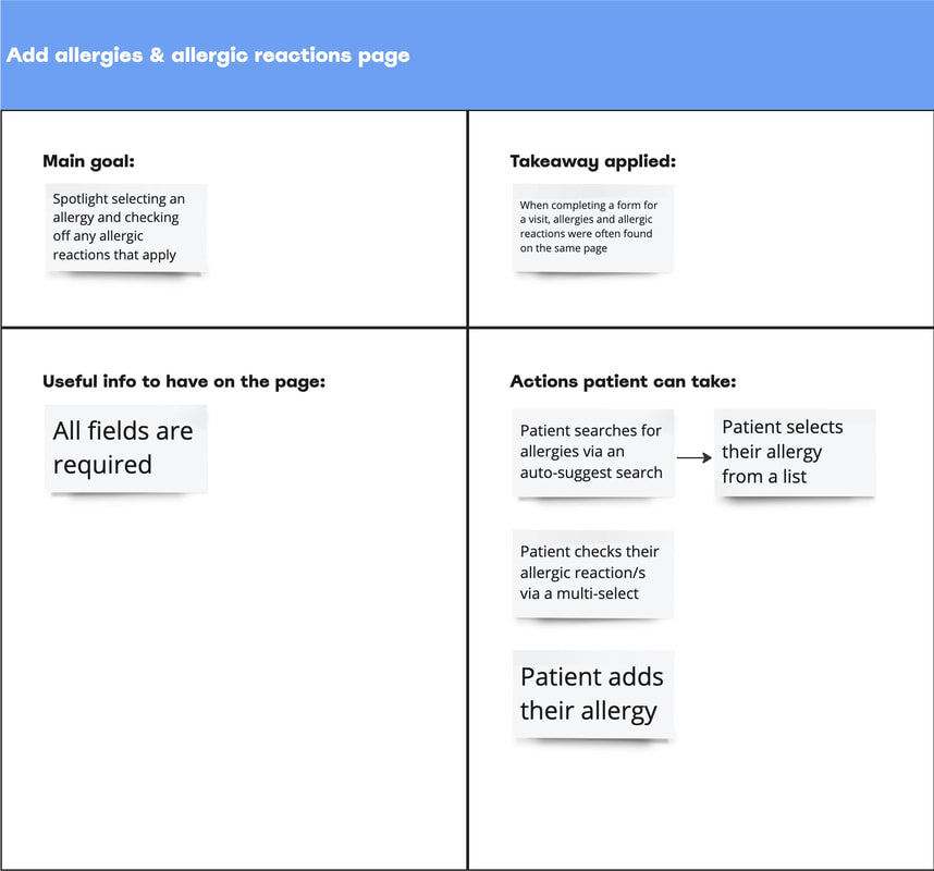
The goal of the add allergies page was to spotlight selecting an allergy and checking off any associated allergic reactions. This replicated what we found in our research - when completing a form for a visit, allergies and allergic reactions were often found on the same page. This experience allowed patients to associate the allergy to the reaction. It eliminated having to go back and forth to make changes. For someone with a lot of allergies, this removed the need to remember the allergy they had just entered on a precious page. This also eliminated complexities when editing allergies. Having this be the only focus on the page allowed patients to focus in on the task. |
|
Patients could fill out whichever part they wanted to first. They could start with reaction and then add the allergy name or vice versa. This tied into the takeaway of choosing one's own adventure.
We chose the auto-suggest search option. Once a patient typed in at least 3 words, allergies would begin to form in a select dropdown. Although this search would rely on spelling, we created a solution to keep patients moving through the flow. I will go more into detail about that in the allergy not in the database section.
We chose the auto-suggest search option. Once a patient typed in at least 3 words, allergies would begin to form in a select dropdown. Although this search would rely on spelling, we created a solution to keep patients moving through the flow. I will go more into detail about that in the allergy not in the database section.
Challenge!
When categorizing the allergic reactions we ran into two clashing requirements.
1. To fit to inclusive design standards, there could only be 8 checkboxes per section.
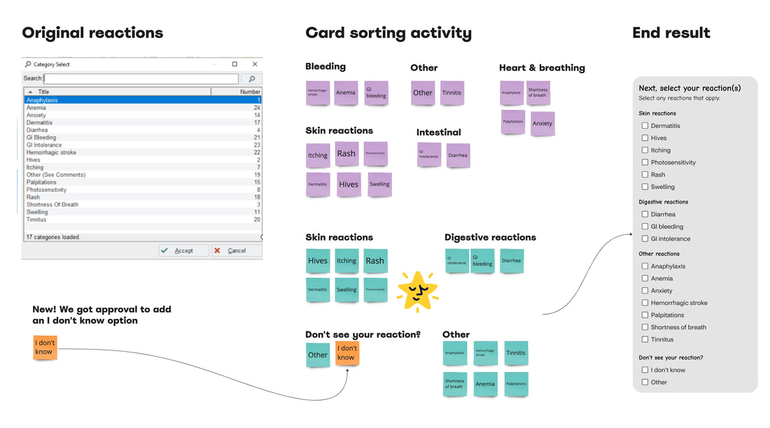
2. All 17 reactions had to be checkbox options. We could not group-like reactions into one checkbox. This was when we learned from the clinical team that each reaction mapped to its own severity level. The health care providers received triggers based on those severities. Like-reactions may link to different severities.
While we couldn't put multiple reactions into a single checkbox, we could label groups of checkboxes. I set up a card sorting activity to determine how to label groups of checkboxes.
I put a sticky note for each allergic reaction (checkbox). I duplicated the stickies and changed the color for my teammate to sort. We each spent about 10 minutes grouping our stickies. As groups formed, we labeled them. Along the way, we kept in mind not to refrain from groupings over 8. Ultimately, we ended up going with my teammates layout. It was understandable, effective, and inclusive.
The labeled groups of checkboxes included:
Additionally, the clinical team approved our suggestion to add a checkbox called 'I don't know'. This accounted for all the patients that may not know their reaction. It also accounted for patients that may have a reaction from the list, but don't know it by the provided terminology.
When categorizing the allergic reactions we ran into two clashing requirements.
1. To fit to inclusive design standards, there could only be 8 checkboxes per section.
2. All 17 reactions had to be checkbox options. We could not group-like reactions into one checkbox. This was when we learned from the clinical team that each reaction mapped to its own severity level. The health care providers received triggers based on those severities. Like-reactions may link to different severities.
While we couldn't put multiple reactions into a single checkbox, we could label groups of checkboxes. I set up a card sorting activity to determine how to label groups of checkboxes.
I put a sticky note for each allergic reaction (checkbox). I duplicated the stickies and changed the color for my teammate to sort. We each spent about 10 minutes grouping our stickies. As groups formed, we labeled them. Along the way, we kept in mind not to refrain from groupings over 8. Ultimately, we ended up going with my teammates layout. It was understandable, effective, and inclusive.
The labeled groups of checkboxes included:
- Skin reactions
- Digestive reactions
- Other reactions
- Don't know your reaction?
Additionally, the clinical team approved our suggestion to add a checkbox called 'I don't know'. This accounted for all the patients that may not know their reaction. It also accounted for patients that may have a reaction from the list, but don't know it by the provided terminology.
|
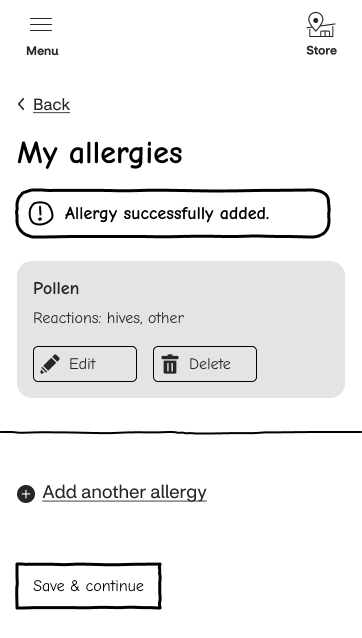
My allergies page
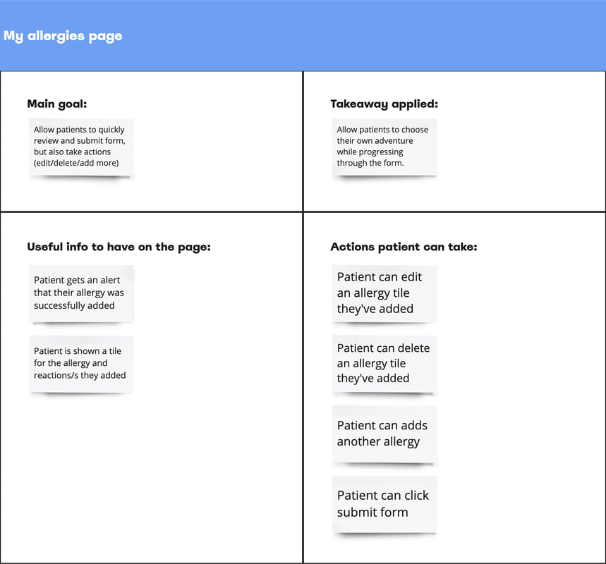
There were a few different purposes for this page, however the main goal was to let patients to choose the best path for them. Patients could quickly review and submit the form or they could take actions: edit, delete, or add another allergy. This page adjusted as a patient took different actions. When an allergy/reaction was added:
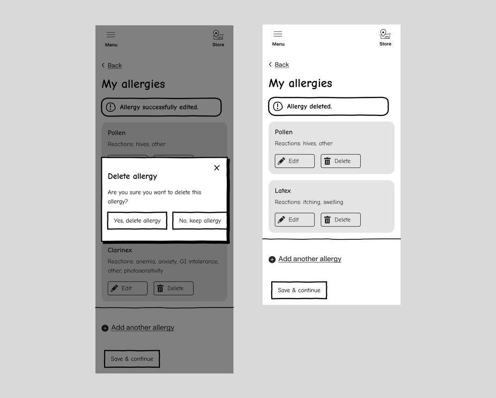
When an allergy/reaction was edited or deleted:
When an allergy/reaction was deleted:
|
|
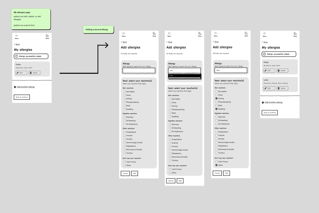
Add another allergy
When a patient added another allergy, they were brought through the same experience as adding their first allergy. This created consistency and helped the patient know what to expect. Once the patient added another allergy, we suggested to the technical team to show the tiles as an unordered list. This way the allergies would stack in the order that they were added. |
|
|
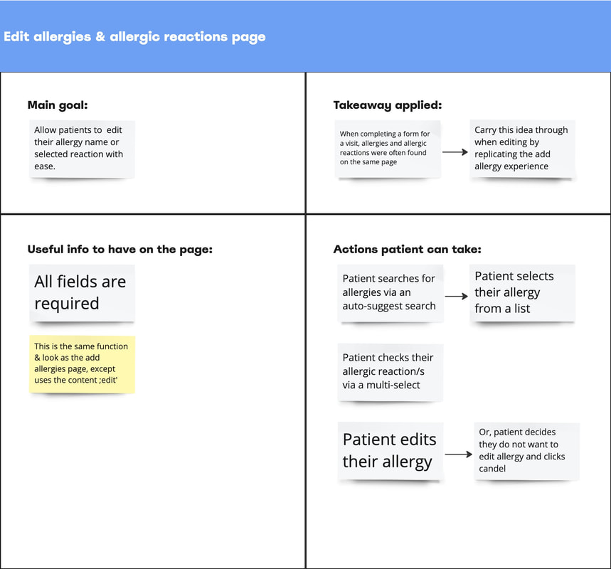
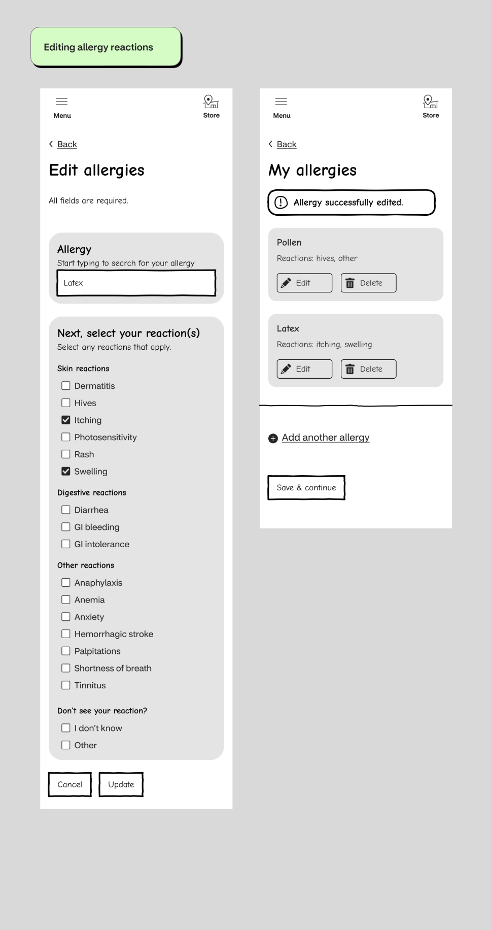
Edit allergies page
The goal of this page was to replicate the add allergy page experience. The only changes included:
|
|
Delete allergies
We decided to put the delete allergies action into a modal. We didn't feel that this action merited the patient going to a whole new page. The content strategist provided content that clearly explained the actions to take. If a patient decided to delete an allergy, they'd would get alert reflecting the status and they would not longer see that allergies tile.
We decided to put the delete allergies action into a modal. We didn't feel that this action merited the patient going to a whole new page. The content strategist provided content that clearly explained the actions to take. If a patient decided to delete an allergy, they'd would get alert reflecting the status and they would not longer see that allergies tile.
Click the back button after submitting allergy form
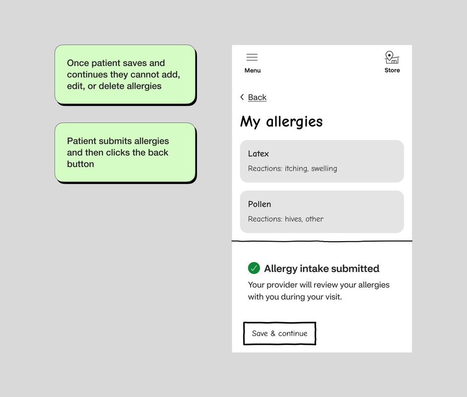
We built a screen to account for a patient clicking the back button after submitting their form. Having spoken with the technical teams, we knew that once a patient submitted their allergy form, they could no longer adjust the form.
In this variation, the patients would see the tiles with their allergies/reactions, but the edit and delete suppressed.
One question I had was, why would patients want to go bacK? My first thought was to add an allergy they forgot about or they wanted to edit something. I wanted to make sure these patients were put at ease by letting them know that the provider would review their allergies with them during the visit.
Next, we designed the experience for patients that searched for an allergy that was not in the database. There were a few reasons why the allergy would not appear in the database.
The overall goal was to keep the patient moving through the experience without being blocked.
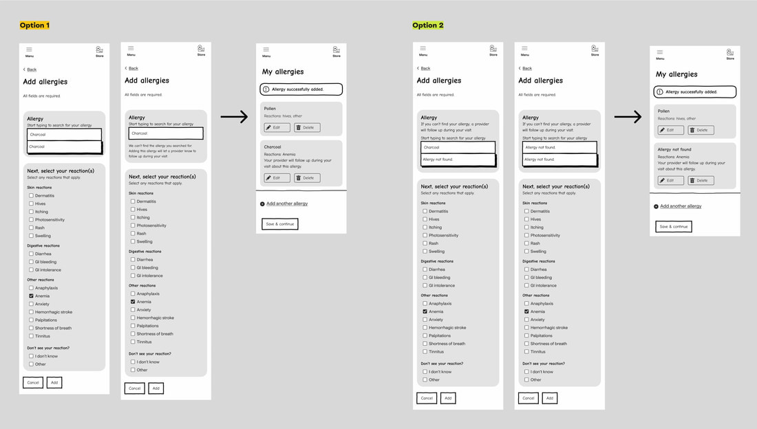
We landed on two different concepts for the product and clinical team to choose from. Both experiences began with how ever many characters it took a patient to get to something that was not in the data base.
- The allergy was simply just not in the database
- The patient did not know how to spell the allergy
- The allergy was in the database as a different name. For example, daisies were not in the data base, but their botanical name, Bellis perennis was.
- The allergy was within a group of allergies. For example, a medication called Azulfidine contains the drug sulfonamides. It is often in the database as a Sulfa allergy.
The overall goal was to keep the patient moving through the experience without being blocked.
We landed on two different concepts for the product and clinical team to choose from. Both experiences began with how ever many characters it took a patient to get to something that was not in the data base.
Create a catch all allergy
Developers would create logic for a 'fake' allergy called 'all other allergies'. This would serve as the systems catch all for all allergies entered that were not in the database.
Patient searched for their allergy
Patients typed an allergy into the search and they reached a point where there were no matches on the backend.
Patient made their selection
After patient added their allergy/reactions
On the My Allergies page, the allergy tile added an extra line of content reiterating that a provider would follow up with them during the visit.
Selection would map to 'all other allergies'
When the patient submitted the allergy form, the back end would map these selections to ‘all other allergies’.
Provider would get flagged with this information
The health care provider's software would get flag this information as well.
Developers would create logic for a 'fake' allergy called 'all other allergies'. This would serve as the systems catch all for all allergies entered that were not in the database.
Patient searched for their allergy
Patients typed an allergy into the search and they reached a point where there were no matches on the backend.
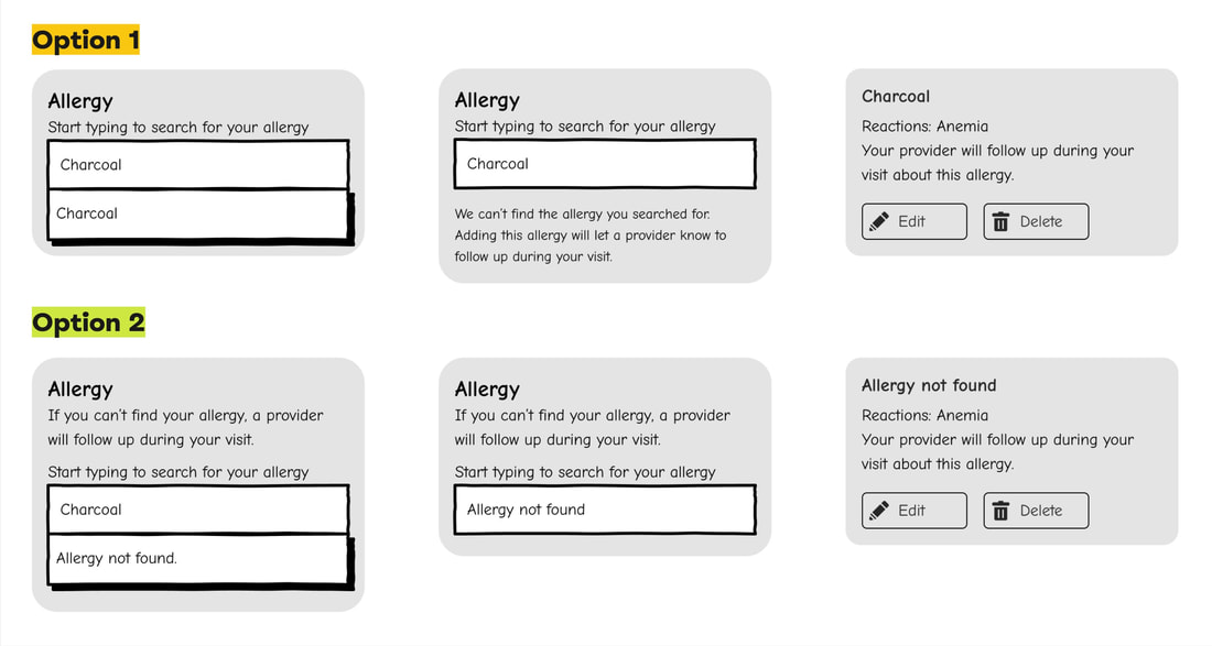
- Option 1, Patients were able to select the allergy they entered despite spelling or it being in the database
- Option 2, Patients were given one selection to choose from: Allergy not found.
Patient made their selection
- Option 1, After a patient made their selection, new content appeared under the search selection. The content provided transparency (the selected allergy was not in the system) and clarity (a provider would follow up during the visit). Then the patient proceeded as usual, selecting their reactions and adding the allergy.
- Option 2, Rather than new content appearing, helper text was provided under the select allergy label at all times. The helper text let the patients know that if they couldn't find their allergy, a provider would follow up during the visit. We took this approach to prevent patients from being blocked. In option 1, patients would always be able to select their allergy. In this version, even the smallest typo could result in a patient selecting no allergies found. This option would encompass a larger group of people which merited helper text being visible at all times.
After patient added their allergy/reactions
On the My Allergies page, the allergy tile added an extra line of content reiterating that a provider would follow up with them during the visit.
- Option 1, The allergy name in the tile would say whatever the patient entered and selected.
- Option 2, The allergy name in tile would say: No allergies found.
Selection would map to 'all other allergies'
When the patient submitted the allergy form, the back end would map these selections to ‘all other allergies’.
Provider would get flagged with this information
The health care provider's software would get flag this information as well.
OUTCOME
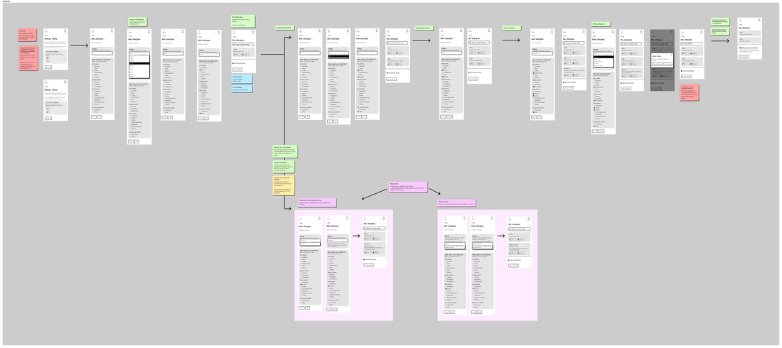
We handed off the lo-fidelity wireframes to be implemented late in the year. I set up the handoff as a user flow. This painted the experience with the use cases. I put notes along the way including:
- Key parts of the flow, ie. add allergy, edit, delete, etc.
- Design recommendations & future considerations
- Notes for engineers, product, and clinical team members
FUTURE CONSIDERATIONS
Ensure patients know that once they submit the form, they cannot edit.
The save and continue button was a PreCheck-in feature being implemented as we worked on the allergy intake form. PreCheck-in was a robust flow containing the majority of forms a patient completed prior to a visit. This button was about saving progress and allowing a patient to continue where they left off if they didn't have time to complete the entire form in one sitting. While determining where this form lived wasn't in scope, we knew there was a chance of it being in PreCheck-in. As a future consideration, we recommended exploring how we could allow the patient to save and continue while also knowing the allergy form could not be adjusted after moving forward. Were other forms in PreCheck-in editable? Could a patient go back once a new session started? Should there be an extra line of content that lets the patient know once they click the allergy form's button, they cannot edit it? We purposely designed the flow with the save and continue button so that when it came time to implement, these thoughts would be considered. In the handoff file, we provided annotations mentioning this consideration as well.
The save and continue button was a PreCheck-in feature being implemented as we worked on the allergy intake form. PreCheck-in was a robust flow containing the majority of forms a patient completed prior to a visit. This button was about saving progress and allowing a patient to continue where they left off if they didn't have time to complete the entire form in one sitting. While determining where this form lived wasn't in scope, we knew there was a chance of it being in PreCheck-in. As a future consideration, we recommended exploring how we could allow the patient to save and continue while also knowing the allergy form could not be adjusted after moving forward. Were other forms in PreCheck-in editable? Could a patient go back once a new session started? Should there be an extra line of content that lets the patient know once they click the allergy form's button, they cannot edit it? We purposely designed the flow with the save and continue button so that when it came time to implement, these thoughts would be considered. In the handoff file, we provided annotations mentioning this consideration as well.

